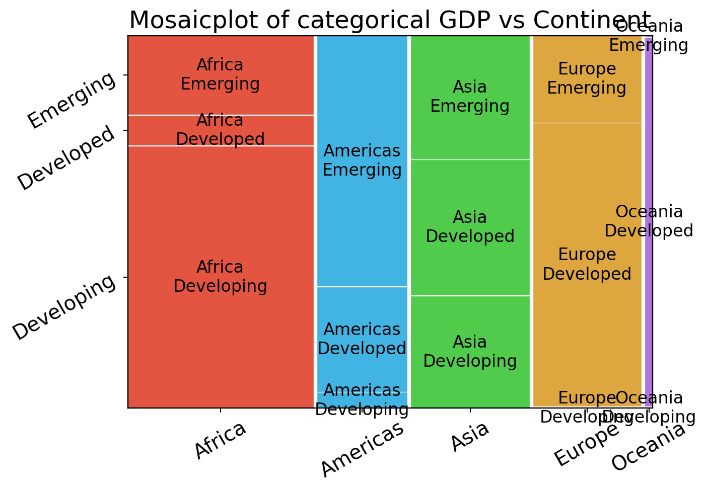
Bivariate & Multivariate Analysis


Exploratory Data Analysis & Unsupervised Learning


Lecturer: Dr. HAS Sothea
——————— Dr. PHAUK Sokkhey

Outline

  • 0. Motivation

  • 1. Bivariate Visualization

  • 2. Multivariate Visualization

  • 3. Time series data

  • 4. Animated charts/graphs

0. Motivation

0. Motivation

Gapminder dataset (1704, 5)

  • This dataset captures the world’s evolution from \(1952\) to \(2007\).
  • Now, take a look at the data from year \(2007\).
Code
from gapminder import gapminder
import numpy as np
data2007 = gapminder[gapminder.year == 2007]  # filter to year 2007
data2007.iloc[:5,:].drop(columns=['year']).style.hide()
country continent lifeExp pop gdpPercap
Afghanistan Asia 43.828000 31889923 974.580338
Albania Europe 76.423000 3600523 5937.029526
Algeria Africa 72.301000 33333216 6223.367465
Angola Africa 42.731000 12420476 4797.231267
Argentina Americas 75.320000 40301927 12779.379640

0. Motivation

Gapminder dataset (1704, 5)

  • This dataset captures the world’s evolution from \(1952\) to \(2007\).
  • Now, take a look at the data from year \(2007\) (summary).
Code
quan_vars = ["pop", "lifeExp", "gdpPercap"]
data2007[quan_vars].describe().transpose().drop(columns=["count", "25%", "75%"]).transpose()
pop lifeExp gdpPercap
mean 4.402122e+07 67.007423 11680.071820
std 1.476214e+08 12.073021 12859.937337
min 1.995790e+05 39.613000 277.551859
50% 1.051753e+07 71.935500 6124.371108
max 1.318683e+09 82.603000 49357.190170

0. Motivation

Gapminder dataset (1704, 5)

  • This dataset captures the world’s evolution from \(1952\) to \(2007\).
  • Now, take a look at the data from year \(2007\) (visualization).
Code
from plotly.subplots import make_subplots
import plotly.graph_objects as go
fig = make_subplots(rows=1, cols=3, 
              subplot_titles=("Boxplot of pop", "Violinplot of lifeExp", "Histogram of GDP Per Capita"))
fig.add_trace(go.Box(y=data2007['pop'], name="pop"), col=1, row=1)
fig.add_trace(go.Violin(y=data2007['lifeExp'], name="lifeExp"), row=1, col=2)
fig.add_trace(go.Histogram(x=data2007['gdpPercap'],
              name="gdpPercap"), row=1, col=3)
fig.update_layout(height=280, width=1000)
fig.update_yaxes(type="log", row=1, col=1)
fig.update_xaxes(title="Population", row=1, col=1)
fig.update_xaxes(title="Life Expectancy", row=1, col=2)
fig.update_xaxes(title="GDP Per Capita", row=1, col=3)
fig.show()

0. Motivation

Objective

The main objectives of this chapter:

  • What clues/indicators tell us how columns are related?
  • What graphs can help us see that relationship?

1. Bivariate Analysis

1.1. Quan. vs Quan.

Indicator: Covariance

  • Suppose \(X=[\text{x}_1,\text{x}_2,...,\text{x}_n]\) be a quan. column.
  • Mean/average: \(\overline{\text{x}}=\displaystyle\frac{1}{n}\sum_{i=1}\text{x}_i\).
  • Variance: \(V(X)=\displaystyle\frac{1}{n-1}\sum_{i=1}^n(\text{x}_i-\overline{x})^2.\)
  • Standard deviation: \(s=\sqrt{V(X)}\).
  • If \(Y=[\text{y}_1,\text{y}_2,\dots,\text{y}_n]\) is an other quan. column, the covaraince between \(X\) and \(Y\) is defined by

\[\text{Cov}(X,Y)=\frac{1}{n-1}\sum_{i=1}(\text{x}_i-\overline{x})(\text{y}_i-\overline{y}).\]

Code
import plotly.express as px
df = px.data.tips()
fig = px.scatter(df, y="tip", x="total_bill", color="sex", hover_data=df.columns)
fig.update_layout(width=380, height=300, title="Tips vs total bill & gender")
fig.show()
tip total_bill sex
0 1.01 16.99 Female
1 1.66 10.34 Male
2 3.50 21.01 Male

1.1. Quan. vs Quan.

Indicator: Covariance

  • Covariance between quan. columns \(X\) and \(Y\):

\[\text{Cov}(X,Y)=\frac{1}{n-1}\sum_{i=1}(\text{x}_i-\overline{x})(\text{y}_i-\overline{y}).\]

  • It determines tendency/direction of the relationship between the two variables.
    • Positive value \(\approx\) change in the same direction.
    • Negative value \(\approx\) change in opposite direction.

It’s hard to interpret the value of covariance as it can be large or small according to the scale of \(X\) and \(Y\).

Code
fig.update_layout(title=f"Tips vs total bill (Cov = {float(np.cov(df['tip'].values, df['total_bill'].values).round(2)[0,1])}) & gender ")
fig.show()
tip total_bill sex
0 1.01 16.99 Female
1 1.66 10.34 Male
2 3.50 21.01 Male

1.1. Quan. vs Quan.

Indicator: Pearson Correlation Coefficient

  • Correlation between two quan. columns \(X\) and \(Y\): \[r=r_{X,Y}=\frac{\sum_{i=1}^n(\text{x}_{i}-\overline{x})(\text{y}_{i}-\overline{y})}{\sqrt{\left(\sum_{i=1}^n(x_{i1}-\overline{x}_{1})^2\right)\left(\sum_{i=1}^n(x_{i2}-\overline{x}_{2})^2\right)}}=\frac{\text{Cov}(X,Y)}{s_Xs_Y}.\]
  • It quantifies the linear relationship/tendency between the two variables.
    • For any pair \(X\) and \(Y\) one has \(-1\leq r\leq 1\).
    • If \(r\approx 1\), then \(X\) and \(Y\) are positively correlated (change in the same direction).
    • If \(r\approx -1\), then \(X\) and \(Y\) are negatively correlated (change in opposite direction).
    • If \(r\approx 0\), then \(Y\) and \(Y\) are decorrelated (no pattern/trend/tendency).
  • It helps identifying informative/useful inputs for the building models.
  • It also helps identifying redundant (strongly correlated) inputs.
  • For tip example: \(\text{Corr}(\text{tip}, \text{bill})=\) 0.676.
  • Correlation does not imply causation; it only indicates a tendency, not a cause-and-effect link [👉 For more, read here].

1.1. Quan. vs Quan.

Indicator: Pearson Correlation Coefficient

1.1. Quan. vs Quan.

Indicator: Pearson Correlation Matrix

  • To detect tendency of linear relationship between many quan. columns, Pearson correlation matrix is a common tool to use.

  • Consider Pearson corr. matrix on Gapminder in 2007:

cor = data2007[["gdpPercap", "lifeExp", "pop"]].corr()
cor.style.background_gradient(cmap='Accent')
  gdpPercap lifeExp pop
gdpPercap 1.000000 0.678662 -0.055676
lifeExp 0.678662 1.000000 0.047553
pop -0.055676 0.047553 1.000000
  • LifeExp and GDP appear to be positively related.
  • Population appears to be decorrelated with the other two.

1.1. Quan./Ordi vs Quan./Ordi

Indicator: Spearman’s Rank Correlation

  • Pearson correlation is sensitive to outliers (we will see that in the lab) and cannot capture non-linear relationship between quantitaive columns.
  • It is not sutiable for ordinal data (dislike-like rating, for example).
  • Spearman’s Rank Correlation does not rely on the value of observations but rather depends on the ‘rank’ of the observations (works with ordinal).
  • Let \(R[\text{x}_i]\) and \(R[\text{y}_i]\) be the rank of observations \(\text{x}_i\) and \(\text{y}_i\) in their own list, then Spearman’s rank correlation coefficient between \(X\) and \(Y\) is defined as the Pearson correlation over the rank of \(X\) and \(Y\), i.e., \[\rho_{X,Y}=r_{R[X],R[Y]}=\frac{\text{Cov}(R[X],R[Y])}{s_{R[X]},s_{R[Y]}}=1-\frac{6\sum_{i=1}^nd_i^2}{n(n^2-1)},\] where \(d_i=R[\text{x}_i]-R[\text{y}_i]\) be the distance in rank of observation \(i\)-th.

1.1. Quan./Ordi vs Quan./Ordi

Indicator: Spearman’s Rank Correlation

  • Example: \(X=[3,2,1,5,8]\) and \(Y=[8,5,0,23,80]\)

Pearson

  • \(\overline{x}=\frac{3+2+1+5+9}{5}=\color{red}{4}\) and \(\overline{y}=\frac{8+5+0+23+80}{5}=\color{blue}{23.2}\).
  • \(s_X=\sqrt{\frac{(3-\color{red}{4})^2+(2-\color{red}{4})^2+\dots+(8-\color{red}{4})^2}{n-1}}=2.8284\) and \(s_Y=\sqrt{\frac{(8-\color{blue}{23.2})^2+(5-\color{blue}{23.2})^2+\dots+(80-\color{blue}{23.2})^2}{n-1}}=29.417\).
  • \(r_{X,Y}=\frac{(3-\color{red}{4})(8-\color{blue}{23.2})+\dots+(8-\color{red}{4})(80-\color{blue}{23.2})}{(2.8284)(29.417)}=0.9735.\)

Spearman

  • \(R[X]=[3,2,1,4,5]\) and \(R[Y]=[3,2,1,4,5]\).
  • All \(d_i=0\) therefore \(\rho_{X,Y}=1-\frac{6\sum_{i}d_i^2}{5(5^2-1)}=1\).

1.1. Quan./Ordi vs Quan./Ordi

Indicator: Spearman’s Rank Correlation

  • Pearson corr. on Gapminder in 2007:
cor = data2007[["gdpPercap", "lifeExp", "pop"]].corr()
cor.style.background_gradient(cmap='Accent')
  gdpPercap lifeExp pop
gdpPercap 1.000000 0.678662 -0.055676
lifeExp 0.678662 1.000000 0.047553
pop -0.055676 0.047553 1.000000
  • Spearman corr. on Gapminder in 2007:
cor = data2007[["gdpPercap", "lifeExp", "pop"]]\
    .corr("spearman")
cor.style.background_gradient(cmap='Accent')
  gdpPercap lifeExp pop
gdpPercap 1.000000 0.856590 -0.064588
lifeExp 0.856590 1.000000 0.003355
pop -0.064588 0.003355 1.000000

1.1. Quan./Ordi vs Quan./Ordi

Indicator: Spearman’s Rank Correlation

  • Consider the change in both coefficients.

1.1. Quan. vs Quan.

Indicator: Spearman (Summary)

Aspect Pearson Spearman
Type Parametric Non-parametric
Measure Linear relationship Monotonic relationship
Data Type Continuous Ordinal or continuous
Outliers Sensitive to outliers Less sensitive to outliers
Range \([-1,1]\) \([-1,1]\)
Interpretation \(\approx\) 1: Perfect positive linear relationship
\(\approx\) -1: Perfect negative linear relationship
\(\approx\) 0: No linear relationship
\(\approx\) 1: Perfect positive rank correlation
\(\approx\) -1: Perfect negative rank correlation
\(\approx\) 0: No rank or no monotonicity correlation

1.1. Quan. vs Quan.

Visualization: Scatterplot

  • Scatterplot shows trends/relation of quantitative pairs.
  • Let’s visualize relation: gdpPercap wih lifeExp & pop.
Code
import plotly.graph_objects as go
import plotly.express as px
data2007 = gapminder.query("year == 2007")
fig1 = px.scatter(data2007, x="gdpPercap", y="lifeExp", hover_name="country", opacity=0.7)
fig1.update_traces(marker=dict(size=10))
fig1.update_layout(height=350, width=500, title="The world GDP vs LifeExp in 2007")
fig1.show()
Code
data2007 = gapminder.query("year == 2007")
fig2 = px.scatter(data2007, x="gdpPercap", y="pop", hover_name="country", opacity=0.7)
fig2.update_traces(marker=dict(size=10))
fig2.update_layout(height=350, width=500, title="The world GDP vs Population in 2007")
fig2.show()

1.1. Quan. vs Quan.

Visualization: Scatterplot

  • Scatterplot shows trends/relation of quantitative pairs.
  • Let’s visualize relation: gdpPercap wih lifeExp & pop.
Code
fig1.update_layout(title="The world (log) GDP vs Population 2007 ")
fig1.update_xaxes(type="log")
fig1.show()
Code
fig2.update_layout(title="The world GDP vs (log) Population 2007 ")
fig2.update_yaxes(type="log")
fig2.show()

1.1. Quan. vs Quan.

Visualization: Scatterplot

  • GPD vs Life Expectancy:
    • General trend: Countries with high GPD tend to be healthier.
    • There are also a few countries with economy well above average yet health condition is still bad.


  • GPD vs Population:
    • General trend: no clear trend!
    • GDP per capita does not appear to be significantly influenced by a country’s population size.

1.1. Quan. vs Quan.

Visualization: Scatterplot

A proper visualization should

  • 🎯 Have a clear purpose – deliver the main message effectively.
  • 👥 Fit the audience – match their knowledge and needs.
  • 📊 Use the right chart – accurately represent the data.
  • 🎨 Be clean and consistent – simple design, meaningful colors, clear labels & title…
  • 🧠 Ensure clarity and honesty – no distortion or clutter.
  • ⚙️ Allow interaction (if needed) – make exploration easy.
  • ♿ Be accessible – readable for everyone, including color-blind users.

1.2. Quan. vs Qual.

Indicator: \(\eta^2\) coefficient

  • If \(\color{red}{G}\) and \(\color{blue}{X}\) are qualitative and quan. columns resp.
  • Between Sum of Squares (BSS): \[\color{blue}{\text{BSS}}=\sum_{g=1}^{\color{red}{G}}n_g(\overline{\text{x}}_g-\color{blue}{\overline{\text{x}}})^2,\] where
    • \(\overline{\text{x}}_g\) is the mean of \(\color{blue}{X}\) over a category \(g\) of \(\color{red}{G}\).
    • \(\color{blue}{\overline{\text{x}}}\) is the global mean of \(\color{blue}{X}\).
    • \(n_g\) is the number of observations within category \(g\) of \(\color{red}{G}\).
  • It measures how distant the values of \(\color{blue}{X}\) are across different groups of \(\color{red}{G}\).
  • Total Sum of Squares (TSS): \[\color{red}{\text{TSS}}=\sum_{i=1}^n(\text{x}_i-\color{blue}{\overline{\text{x}}})^2.\]

1.2. Quan. vs Qual.

Indicator: \(\eta^2\) coefficient

  • \(\eta\)-squared coefficient: \(\eta^2=\frac{\color{blue}{\text{BSS}}}{\color{red}{\text{TSS}}}.\)

  • One always has \(0\leq \eta^2\leq 1\):

    • \(\eta^2\approx 0\): no relation between group \(\color{red}{G}\) and quan. column \(\color{blue}{X}\) (similar).
    • \(\eta^2\approx 1\): strong relation (differ).
  • The \(\eta^2\) coefficient measures the proportion of variation in the quan. variable that is explained by the categories of the qual. variable.
  • \(\eta^2\) is normally used to study the effect of group on some quan. variable on different classes of another qual. variable known as Analysis of Variance (ANOVA).
  • Just like Pearson coefficient, it’s sensitive to outliers!
  • Example: \(\eta^2\)-coefficients between lifeExp and gdpPercap on different continent:
LifeExp GDP
Continent 0.635 0.424

1.2. Quan. vs Qual.

Visualization: Conditional box/dot plots

  • To see relation between Values within different Group, we can use:
    • Conditional Boxplots: boxplots within different groups.
    • Conditional Histogram/Density are also possible but not common.
Code
sorted_data = data2007.sort_values(by='lifeExp')
fig = px.box(data2007, x="continent", y="lifeExp", points='all', hover_name="country", color="continent", category_orders={'continent': sorted_data['continent']})
fig.update_layout(title="Life Expectancy on each continent in 2007", height=300, width=450)
fig.show()
  • 🔑 The distinction of quan. values between different groups indicates a connection between the pairs.

  • Example:

    • Clear distinction of lifeExp accross different continent suggests that there is a relation between the two.
    • continent is useful for predicting / explaining lifeExp.

1.2. Quan. vs Qual.

Visualization: Conditional histogram

  • To see relation between Values within different Group, we can use:
    • Conditional Boxplots: boxplots within different groups.
    • Conditional Histogram/Density are also possible but not common.
Code
import plotly.figure_factory as ff
group_labels = list(data2007.continent.unique())
hist_data = [data2007.lifeExp[data2007.continent == x] for x in group_labels]
colors = ["#f1ab17", "#f13c26", "#9be155", "#4ab8dc", "#d567f3"]
fig3 = ff.create_distplot(hist_data, group_labels, colors=colors,
                         bin_size=1.5, show_rug=False)
fig3.update_layout(title="Life Expectancy on each continent in 2007", height=300, width=450)
fig3.show()
  • 🔑 The distinction of quan. values between different groups indicates a connection between the pairs.

  • Example:

    • Clear distinction of lifeExp accross different continent suggests that there is a relation between the two.
    • continent is useful for predicting / explaining lifeExp.

1.2. Quan. vs Qual.

Visualization: Conditional Box/Violin Plot

  • How about GDP on each continent?
Code
sorted_data = data2007.sort_values(by='gdpPercap')
hist_data_gdp = [data2007.gdpPercap[data2007.continent == x] for x in group_labels]
colors = ["#f1ab17", "#f13c26", "#9be155", "#4ab8dc", "#d567f3"]
fig4 = px.box(data2007, 
    x="continent", y="gdpPercap", hover_name="country", points='all',
    color="continent", category_orders={'continent': sorted_data['continent']})
fig4.update_layout(title="GDP per Capita on each continent in 2007", height=350, width=500)
fig4.show()
Code
sorted_data = data2007.sort_values(by='gdpPercap')
hist_data_gdp = [data2007.gdpPercap[data2007.continent == x] for x in group_labels]
colors = ["#f1ab17", "#f13c26", "#9be155", "#4ab8dc", "#d567f3"]
fig_ = px.violin(data2007, x="continent", y="gdpPercap", 
    hover_name="country", color="continent", points='all',
    category_orders={'continent': sorted_data['continent']})
fig_.update_layout(title="GDP per Capita on each continent in 2007", height=350, width=500)
fig_.show()
  • Example:
    • The separation of GDP per Capita between coninents is not as clear as Life Expectancy, yet one can still see the differences.
    • Continent is useful for predicting / explaining gdpPercap though not as strong/clear as with lifeExp.
    • One would be a good predictor for another.

1.2. Quan. vs Qual.

Indicator & Visualization

Code
import plotly.express as px
fig = px.box(data2007, 
    x='continent', 
    y='lifeExp', 
    points='all',
    category_orders={'continent': sorted_data['continent']}, 
    color='continent')
fig.update_layout(
    height=500, 
    width=500,
    title=f"LifeExp per continent with eta-squared {np.round(df_eta['LifeExp'].values[0], 3)}")
fig.show()
Code
fig4 = px.box(data2007, 
    x='continent', 
    y='gdpPercap', 
    points='all',
    category_orders={'continent': sorted_data['continent']}, 
    color='continent')
fig4.update_layout(
    height=500, 
    width=500,
    title=f"GDP per continent with eta-squared {np.round(df_eta['GDP'].values[0], 3)}")
fig4.show()

1.3. Qual. vs Qual.

Visualization: Mosaic plot

  • We don’t have many qualitative columns,
    I grouped GDP per Capita as follows:
    • If GDP \(\leq 33.33\%\) 👉 Developing
    • elif GDP \(\leq 66.66\%\) 👉 Emerging
    • else: 👉 Developed.
  • Example:
    • As GDP seems to be related to continent, it remains true with categorical GDP.
    • In Asia, the three types of economic conditions are well balanced, whereas the majority of African countries are developing, followed by emerging economies.
Code
from statsmodels.graphics.mosaicplot import mosaic
import matplotlib.pyplot as plt
import pandas as pd
fig, ax = plt.subplots(figsize=(7, 5))
plt.rcParams.update({'font.size': 15})
def prop(key):
    if "Asia" in key:
        return {'color': '#51cb4b'}
    if "Africa" in key:
        return {'color': '#e35441'}
    if "Americas" in key:
        return {'color': '#41b4e3'}
    if "Europe" in key:
        return {'color': '#dda63e'}
    if "Oceania" in key:
        return {'color': '#b374df'}

data2007['gdp_category'] = pd.qcut(data2007['gdpPercap'], q=3, labels=['Developing', 'Emerging', 'Developed'])
mosaic(data2007.sort_values('continent'), ['continent','gdp_category'], 
    gap=0.01, properties = prop, 
    label_rotation=30, ax=ax)
plt.title("Mosaicplot of categorical GDP vs Continent")
plt.show()

1.3. Qual. vs Qual.

Visualization: Stacked/Grouped barplots

  • We don’t have many qualitative columns,
    I do grouped GDP:
    • If GDP \(\leq 33.33\%\) 👉 Developing
    • elif GDP \(\leq 66.66\%\) 👉 Emerging
    • else: 👉 Developed.
  • Example:
    • As GDP seems to be related to continent, it remains true with categorical GDP.
    • In Asia, the three types of economic conditions are well balanced, whereas the majority of African countries are developing, followed by emerging economies.
Code
df_freq = data2007.groupby(['continent','gdp_category']).size().reset_index(name='Freq')
df_freq['Percent'] = df_freq.groupby('continent')['Freq'].apply(lambda x: x/x.sum() * 100).reset_index(level=0, drop=True)
fig = px.bar(
    df_freq, 
    x="continent", 
    y="Percent",
    color="gdp_category",
    barmode='stack',
    text= df_freq['Percent'].round(2).astype(str) + '%')
fig.update_layout(width=510, height=470, 
    title='Stacked Barplot of Categorical GDP vs Continent')
fig.show()
Code
fig = px.bar(
    df_freq, 
    x="continent", 
    y="Freq",
    color="gdp_category",
    barmode='group',
    text= df_freq['Percent'].round(2).astype(str) + '%')
fig.update_layout(width=510, height=470, title='Grouped Barplot of Categorical GDP vs Continent')
fig.show()

1.3. Qual. vs Qual.

Indicator: \(\chi^2\) test

  • The contingency table of two nominal variables \(\color{blue}{X}\) and \(\color{red}{Y}\) is defined by:
\(\color{blue}{X}\) - \(\color{red}{Y}\) \(\color{red}{Y_1}\) \(\dots\) \(\color{red}{Y_J}\) Total
\(\color{blue}{X_1}\) \(n_{1,1}\) \(\dots\) \(n_{1,J}\) \(\color{blue}{n_{1,.}}\)
\(\vdots\) \(\vdots\) \(\ddots\) \(\vdots\) \(\color{blue}{\vdots}\)
\(\color{blue}{X_I}\) \(n_{I,1}\) \(\dots\) \(n_{I,J}\) \(\color{blue}{n_{I,.}}\)
Total \(\color{red}{n_{.,1}}\) \(\color{red}{\dots}\) \(\color{red}{n_{.,J}}\) \(N\)

where \(n_{i,j}\) is the freq of observations being in class \(\color{blue}{X_i}\) of variable \(\color{blue}{X}\) and \(\color{red}{Y_j}\) of variable \(\color{red}{Y}\).

  • Obs. rel. freq: \(O_{i,j}=n_{i,j}/N\).
  • Exp. rel. freq: \(E_{i,j}=\color{blue}{O_{i,.}}\times \color{red}{O_{.,j}}=\frac{\color{blue}{n_{i,.}}\color{red}{n_{.,j}}}{N^2}\).
  • We'd like to check if \(\color{blue}{X}\) & \(\color{red}{Y}\) are independent?
  • \(\chi^2\) hypothesis test: \[\begin{cases}H_0&: \color{blue}{X}\text{ is indepedent of }\color{red}{Y}\\ H_1&: \color{blue}{X}\text{ is NOT indepedent of }\color{red}{Y}.\end{cases}\]
  • 🔑 What’s can we say about the observed and expected relative freauency \(O_{i,j}\) & \(E_{i,j}\)?
  • 🔑 Under \(H_0\) is true, then \(\color{green}{O_{i,j}\approx E_{i,j}}\).
  • \(\chi^2\)-distance: \(\chi^2(\color{blue}{X},\color{red}{Y})=\sum_{i,j}\frac{(O_{i,j}-E_{i,j})^2}{E_{i,j}}\).

Under the assumption that \(H_0\) is true, then \(\chi^2(\color{blue}{X},\color{red}{Y})\sim \chi^2(\text{df})\) with \(\text{df}=(\color{blue}{I}-1)(\color{red}{J}-1)\).

  • In practice, compute
    • Degree of freedom \(\text{df}\) and \(\chi^2(\color{blue}{X},\color{red}{Y})\).
    • \(\text{p-val}=\mathbb{P}(\chi^2(\text{df}) \geq \chi^2(\color{blue}{X},\color{red}{Y}))\).
    • Small \(\text{p-val}\Rightarrow\) reject \(H_0\).

1.3. Qual. vs Qual.

Indicator: \(\chi^2\) test (Summary)

  • Observed two-way relative freq. table:
\(\color{blue}{X}\) - \(\color{red}{Y}\) \(\color{red}{Y_1}\) \(\dots\) \(\color{red}{Y_J}\) Total
\(\color{blue}{X_1}\) \(O_{1,1}\) \(\dots\) \(O_{1,J}\) \(\color{blue}{O_{1,.}}\)
\(\vdots\) \(\vdots\) \(\ddots\) \(\vdots\) \(\color{blue}{\vdots}\)
\(\color{blue}{X_I}\) \(O_{I,1}\) \(\dots\) \(O_{I,J}\) \(\color{blue}{O_{I,.}}\)
Total \(\color{red}{O_{.,1}}\) \(\color{red}{\dots}\) \(\color{red}{O_{.,J}}\) \(1\)
  • Expected two-way relative freq. table:
\(\color{blue}{X}\) - \(\color{red}{Y}\) \(\color{red}{Y_1}\) \(\dots\) \(\color{red}{Y_J}\)
\(\color{blue}{X_1}\) \(\color{red}{O_{.,1}}\color{blue}{O_{1,.}}\) \(\dots\) \(\color{red}{O_{.,J}}\color{blue}{O_{1,.}}\)
\(\vdots\) \(\vdots\) \(\ddots\) \(\vdots\)
\(\color{blue}{X_I}\) \(\color{red}{O_{.,1}}\color{blue}{O_{I,.}}\) \(\dots\) \(\color{red}{O_{.,J}}\color{blue}{O_{I,.}}\)
  • \(\chi^2(\color{blue}{X},\color{red}{Y})\) measures how different they are!
  • \(\chi^2\) hypothesis test: \[\begin{cases}H_0&: \color{blue}{X}\text{ is indepedent of }\color{red}{Y}\\ H_1&: \color{blue}{X}\text{ is NOT indepedent of }\color{red}{Y}.\end{cases}\]
  • 🔑 What’s can we say about the observed and expected relative freauency \(O_{i,j}\) & \(E_{i,j}\)?
  • 🔑 Under \(H_0\) is true, then \(\color{green}{O_{i,j}\approx E_{i,j}}\).
  • \(\chi^2\)-distance: \(\chi^2(\color{blue}{X},\color{red}{Y})=\sum_{i,j}\frac{(O_{i,j}-E_{i,j})^2}{E_{i,j}}\).

Under the assumption that \(H_0\) is true, then \(\chi^2(\color{blue}{X},\color{red}{Y})\sim \chi^2(\text{df})\) with \(\text{df}=(\color{blue}{I}-1)(\color{red}{J}-1)\).

  • In practice, compute
    • Degree of freedom \(\text{df}\) and \(\chi^2(\color{blue}{X},\color{red}{Y})\).
    • \(\color{blue}{\text{p-val}}=\mathbb{P}(\chi^2(\text{df}) \geq \chi^2(\color{blue}{X},\color{red}{Y}))\).
    • Small \(\text{p-val}\Rightarrow\) reject \(H_0\).

1.3. Qual. vs Qual.

Indicator: \(\chi^2\) test (Summary)

  • Observed two-way relative freq. table:
\(\color{blue}{X}\) - \(\color{red}{Y}\) \(\color{red}{Y_1}\) \(\dots\) \(\color{red}{Y_J}\) Total
\(\color{blue}{X_1}\) \(O_{1,1}\) \(\dots\) \(O_{1,J}\) \(\color{blue}{O_{1,.}}\)
\(\vdots\) \(\vdots\) \(\ddots\) \(\vdots\) \(\color{blue}{\vdots}\)
\(\color{blue}{X_I}\) \(O_{I,1}\) \(\dots\) \(O_{I,J}\) \(\color{blue}{O_{I,.}}\)
Total \(\color{red}{O_{.,1}}\) \(\color{red}{\dots}\) \(\color{red}{O_{.,J}}\) \(1\)
  • Expected two-way relative freq. table:
\(\color{blue}{X}\) - \(\color{red}{Y}\) \(\color{red}{Y_1}\) \(\dots\) \(\color{red}{Y_J}\)
\(\color{blue}{X_1}\) \(\color{red}{O_{.,1}}\color{blue}{O_{1,.}}\) \(\dots\) \(\color{red}{O_{.,J}}\color{blue}{O_{1,.}}\)
\(\vdots\) \(\vdots\) \(\ddots\) \(\vdots\)
\(\color{blue}{X_I}\) \(\color{red}{O_{.,1}}\color{blue}{O_{I,.}}\) \(\dots\) \(\color{red}{O_{.,J}}\color{blue}{O_{I,.}}\)
  • \(\chi^2(\color{blue}{X},\color{red}{Y})\) measures how different they are!

Under the assumption that \(H_0\) is true, then \(\chi^2(\color{blue}{X},\color{red}{Y})\sim \chi^2(\text{df})\) with \(\text{df}=(\color{blue}{I}-1)(\color{red}{J}-1)\).

  • In practice, compute
    • \(\chi^2(\color{blue}{X},\color{red}{Y})\) and degree of freedom \(\text{df}\).
    • \(\color{blue}{\text{p-val}}=\mathbb{P}(\chi^2(\text{df}) \geq \chi^2(\color{blue}{X},\color{red}{Y}))\).
    • Small \(\color{blue}{\text{p-val}}\ (<0.05)\Rightarrow\) reject \(H_0\).
Code
import plotly.graph_objects as go
from scipy.stats import chi2

# Create x-axis values (domain for chi-squared)
x = np.linspace(0, 50, 100)

# Degrees of freedom to display
dfs = [1, 5, 10, 15, 20, 30]

# Create figure
fig = go.Figure()

# Add trace for each degree of freedom
for df in dfs:
    y = chi2.pdf(x, df)
    
    # Add line to plot
    fig.add_trace(
        go.Scatter(
            x=x,
            y=y,
            mode='lines',
            name=f'df = {df}',
            line=dict(width=2)
        )
    )

# Update layout
fig.update_layout(
    title=r'$\chi^2(\text{df})$',
    xaxis_title='x',
    yaxis_title='Density',
    legend_title='DFs',
    template='plotly_white',
    hovermode='closest',
    width=490,
    height=270
)

fig.show()

1.3. Qual. vs Qual.

Indicator: \(\chi^2\) test (Example)

F SE SEP MEP E MW NW
3 263 1085 7704 4346 4052 1551 2319
2 616 2265 10088 8889 11264 4713 3892
1 222 950 2864 3238 4517 1910 1145
0 126 562 1105 1420 2596 1531 622
  • 0-3: less to strong favor in vaccine
  • F : Farmer
  • SE : Self-employed and entrepreneurs
  • SEP : Senior executive professionals
  • MEP : Middle executive professionals
  • E : Employees
  • MW : Manual workers
  • NW : Never worked and others.
Code
df_vaccine = df.melt(value_name='Count', var_name='Job')
df_vaccine['Vaccine Favor'] = list(range(4)) * 7
df_vaccine['Vaccine Favor'] = df_vaccine[['Vaccine Favor']].astype(object)
temp = df_vaccine.groupby('Job')['Count'].apply(lambda x: x/x.sum() * 100).reset_index(level=1)
temp.columns = ['level_1', 'Percent']
df_vaccine = pd.merge(temp, df_vaccine, left_on='level_1', right_index=True, how='left')
fig = px.bar(
    df_vaccine, 
    x="Job", 
    y="Percent",
    color="Vaccine Favor",
    barmode='stack',
    text= df_vaccine['Percent'].round(2).astype(str) + '%')
fig.update_layout(width=510, height=310, 
    title='Stacked Barplot of Job vs Vaccine Favor')
fig.show()
  • We have \(\text{df}=\) 18 and \(\chi^2(18)\approx\) 3298.

1.3. Qual. vs Qual.

Indicator: Cramér’s V

  • It’s based on Pearson’s Chi-squared statistics by Harald Cramér in 1946.
  • Cramér’s V formula: \(V=\sqrt{\frac{\chi^2/n}{\min(I-1,J-1)}}.\)

Property

  • \(V\in [0,1]\) with \(V\approx 1\) indicating strong association.
  • It’s a biased estimator of the association strength between the two qual. variables.
  • It can be heavily overestimate the true association strength.
  • Bias correction of Cramér’s V: \(\tilde{V}=\sqrt{\frac{\tilde{\phi}^2}{\min(\tilde{I}-1,\tilde{J}-1)}},\) where \(\tilde{\phi}^2=\max\left(0,\frac{\chi^2}{n}-\frac{\text{df}}{n-1}\right)\), \(\tilde{I}=I-\frac{(I-1)^2}{n-1}\) and \(\tilde{J}=J-\frac{(J-1)^2}{n-1}\).

2. Multiple Information

2.1. Color: quantitative & qualitative

  • Color can represent:
    • qualitative data (discrete color).
    • quantitative (in form of gradient)
Code
import numpy as np
data2007[' '] = np.repeat('Data', data2007.shape[0])
fig = px.scatter(
    data2007, x="gdpPercap", y="lifeExp",
    hover_name="country", size_max=80, color=" ")
fig.update_layout(width=472, height=400, title='Life Expectancy vs GDP per Capita & Continent')
fig.update_xaxes(type="log")
fig.show()

2.1. Color: quantitative & qualitative

  • Color can represent:
    • qualitative data (discrete color).
    • quantitative (in form of gradient)
  • Example:
    • Color = continent, which is a categorical column.
Code
fig = px.scatter(
    data2007, x="gdpPercap", y="lifeExp", color="continent", hover_name="country", size_max=80)
fig.update_layout(width=500, height=400, title='Life Expectancy vs GDP per Capita & Continent')
fig.update_xaxes(type="log")
fig.show()

2.1. Color: quantitative & qualitative

  • Color can represent:
    • qualitative data (discrete color).
    • quantitative (in form of gradient)
  • Example:
    • Color = continent, which is a categorical column.
    • Color = leftExp, which is a quantitative column.
Code
fig = px.scatter(
    data2007, x="gdpPercap", y="lifeExp", color="lifeExp", hover_name="country", size_max=80)
fig.update_layout(width=500, height=240, title='Life Expectancy vs GDP per Capita & Continent')
fig.update_xaxes(type="log")
fig.show()

2.2. Shape/Symbol: qualitative

  • Shape for representing qualitative data.

  • Example:

    • Symbol = gdp_category.
    • Color = continent.

Combining numerous colors and symbols can complicate a graph.

Use them carefully and only when appropriate.

Code
fig = px.scatter(
    data2007, x="gdpPercap", y="lifeExp", color="continent", 
    hover_name="country", symbol='gdp_category', size_max=80)
fig.update_layout(width=500, height=350, title='Life Expectancy vs GDP per Capita & Continent')
fig.update_xaxes(type="log")
fig.show()

2.3. Size: quantitative

  • Size for representing quantitative data.

  • Example:

    • Size = pop.
    • Color = continent.

Colors and size are common, and the resulting graphs are often called Bubble chart.

One shoule choose suitable max size to have a nice graph.

Code
fig = px.scatter(
    data2007, x="gdpPercap", y="lifeExp", color="continent",
    hover_name="country", size="pop", size_max=35)
fig.update_layout(width=500, height=370, title='Life Expectancy, GDP, Population & Continent')
fig.update_xaxes(type="log")
fig.show()

2.4. 3D: quantitative

  • All the previous options can be used with 3D scatter plot.

  • Example: Marketing

    • X = Youtube.
    • Y = Facebook.
    • Z = Sales.
    • Size = Newspaper.
    • Color = Newspaper.

Avoid 3D if they are not interactive [Section: “Don’t go 3D” by Claus O. Wilke (2019)].

3. Time series data

3.1. Quantitative: lineplot

  • Let’s take a look at Oceania from 1952 to 2007.
Code
df_ocean = gapminder.query("continent == 'Oceania'")
fig = px.line(df_ocean, x='year', y='lifeExp',
    symbol="country", color="country",
    title="Evolution of Life Expectancy")
fig.update_layout(height=350, width=330)
fig.show()
Code
fig = px.line(df_ocean, x='year', y='pop',
    symbol="country", color="country",
    title="Evolution of Population")
fig.update_layout(height=350, width=330)
fig.show()
Code
fig = px.line(df_ocean, x='year', y='gdpPercap',
    symbol="country", color="country",
    title="Evolution of GDP per Capita")
fig.update_layout(height=350, width=330)
fig.show()
  • Is there any other country’s evolution you would like to see?

3.1. Quantitative: lineplot

  • Is there any other country’s evolution you would like to see?

3.2. Qualitative: Evoluational barplots

  • Let’s take a look at the evolution of GDP per capita categories for Asian countries over time.
Code
def cat_gdp(yearly_data):
    return pd.qcut(yearly_data, q=3, labels=['Developing', 'Emerging', 'Developed'])
df = gapminder
# Apply the function to each year
df['GDP_Category'] = df.groupby('year').apply(lambda x: cat_gdp(x.gdpPercap)).reset_index(level=0, drop=True)

df_Af = df.query("continent == 'Asia'")
# Aggregate the data
df_agg = df_Af.groupby(['year', 'GDP_Category']).size().reset_index(name='Count')

# Create the stacked bar chart
fig = px.bar(
    df_agg, x='year', y='Count', 
    color='GDP_Category', barmode='stack',
    title="Evolution of Asian Countries' GDP Categories from 1952 to 2007",
    labels={'Count': 'Number of Countries', 'year': 'Year'})

fig.update_layout(height=350, width=1000)
fig.show()

Animated Graphs

4. Animated Graphs

Animation with Plotly

Code
import plotly.express as px
df = px.data.gapminder()
fig_anime = px.scatter(df, x="gdpPercap", y="lifeExp", animation_frame="year", animation_group="country",
           size="pop", color="continent", hover_name="country",
           log_x=True, size_max=50, range_x=[100,100000], 
           range_y=[25,90])
fig_anime.update_layout(height=460, width=1000, 
    title="The Evolution of the World in a Single Graph")


Start by looking at indicators, then visualize the interesting ones.

🥳 Yeahhhh….


Let’s Party… 🥂