import numpy as np
def simulateData(k, n):
    # np.random.seed(69)
    X = np.row_stack([np.random.multivariate_normal(np.random.uniform(-10,10,2), 3*np.eye(2), size=n) for i in range(k)])
return X, np.repeat([str(i) for i in range(1,k+1)], n)TP4 - Clustering
Exploratory Data Analysis & Unsuperivsed Learning
M1-DAS
Lecturer: HAS Sothea, PhD
Objective: Clustering is technique of ML and Data Analysis used to group similar data points together. The goal is to partition a dataset into distinct subsets, or clusters, such that data points within each cluster are more similar to each other than to those in other clusters. This practical class aims to enhance your understanding of two different clustering algorithms, including their strengths and weaknesses.
The
Jupyter Notebookfor this TP can be downloaded here: TP4-Clustering.
1. Kmeans Algorithm
We will begin with a toy example using simulated dataset.
a. Write a function simulateData(k, n) that generates an ideal dataset for Kmeans, consisting of \(k\) groups with \(n\) observations within each group, of 2D normally distributed data points (you can choose any value of \(K\in\{3,4,5,...,8\}\)). Visualize your dataset, make sure that the groups are spread evenly. I set an example below:
# Simulate
import pandas as pd

data, labels = simulateData(k=3,n=100)
df_sim = pd.DataFrame({
    'x' : data[:,0],
    'y' : data[:,1],
    'label' : labels
})
import plotly.io as pio
pio.renderers.default = 'notebook'
import plotly.express as px
fig = px.scatter(df_sim, x="x", y="y")
fig.update_layout(width=500, height=400, title="Simulated data with 3 clusters")
fig.show()b. Perform Kmeans clustering algorithm on that the generated dataset using different number of clusters. - Check that the equality: With-class variance + Between-class variance = Total Variance. - For each number of cluster \(k\), compute within-class variances. - Draw the values of within-class variances as a function of number of cluster. - What do you observe?
from sklearn.cluster import KMeans
num_clusters = list(range(1,11))  # list of cadidate number of clusters
within_class_var = []
for k in num_clusters:
    km = KMeans(n_clusters=k)    # initialization of object
    km = km.fit(data)            # Perform KMeans algorithm
    within_class_var.append(km.inertia_)     # store within class variance inside 'within_class_var'
within_class_df = pd.DataFrame(
{'Number of clusters': num_clusters,
'Variance within class': within_class_var}
)
within_class_df| Number of clusters | Variance within class | |
|---|---|---|
| 0 | 1 | 22489.300218 |
| 1 | 2 | 10281.741500 |
| 2 | 3 | 1653.511929 |
| 3 | 4 | 1467.532139 |
| 4 | 5 | 1247.508408 |
| 5 | 6 | 1084.552004 |
| 6 | 7 | 939.160013 |
| 7 | 8 | 868.833842 |
| 8 | 9 | 782.201585 |
| 9 | 10 | 712.115656 |
import plotly.io as pio
pio.renderers.default = 'notebook'

fig1 = px.line(
    data_frame=within_class_df,
    x="Number of clusters",
    y = "Variance within class",
    markers="Variance within class")
fig1.update_layout(title="Within-class variance as a function of number of clusters",
                width=600, height=400)
fig1.show()
Based on this graph, we observed an elbow at \(K=3\), therefore the most suitable number of clusters is \(3\).
c. Can you propose a systematic approach to approximate the most suitable number of clusters?
def optimal_clusters(data, list_k = list(range(1, 11)), n_init = 1):
    num_clusters = list_k  # list of cadidate number of clusters
    within_class_var = []
    for k in num_clusters:
        km = KMeans(n_clusters=k, n_init=n_init)    # initialization of object
        km = km.fit(data)            # Perform KMeans algorithm
        within_class_var.append(km.inertia_)     # store within class variance inside 'within_class_var'
    dif = np.diff(within_class_var)
    ratio = dif[:-1]/dif[1:]
    opt_k = list_k[np.argmax(ratio) + 1]
return opt_kprint(f'The optimal number of cluster is {optimal_clusters(data, list_k=[1,2,3,4,5,10,20])}')The optimal number of cluster is 3import plotly.io as pio
pio.renderers.default = 'notebook'
cluster = KMeans(n_clusters=3, n_init=3) # define KMeans object
cluster_fit = cluster.fit(data) # Fit on data
pred_labels = cluster_fit.labels_.astype(str) # Return label of each data point
fig1 = px.scatter(x=data[:,0], y=data[:,1], color=pred_labels)
fig1.update_layout(width=500, height=400, title = "Simulated data with 3 clusters")
fig1.show()d. Compute and visualize Silhouette Coefficient for each number of clusters considered above. Conclude.
from sklearn.metrics import silhouette_score, silhouette_samples
import matplotlib.pyplot as plt
kmeans = KMeans(n_clusters=3, n_init=100)
clusters = kmeans.fit_predict(data)

# Compute silhouette scores
silhouette_avg = silhouette_score(data, clusters)
sample_silhouette_values = silhouette_samples(data, clusters)

# Plot silhouette scores
fig, ax1 = plt.subplots(1, 1)
y_lower = 10
for k in range(kmeans.n_clusters):
    ith_cluster_silhouette_values = sample_silhouette_values[clusters == k]
    ith_cluster_silhouette_values.sort()
    size_cluster_k = ith_cluster_silhouette_values.shape[0]
    y_upper = y_lower + size_cluster_k
    ax1.fill_betweenx(np.arange(y_lower, y_upper), 0,
                      ith_cluster_silhouette_values)
    ax1.text(-0.05, y_lower + 0.5 * size_cluster_k, str(k))
    y_lower = y_upper + 10
ax1.set_title("Silhouette plot for the various clusters")
ax1.set_xlabel("Silhouette coefficient values")
ax1.set_ylabel("Cluster label")
ax1.axvline(x=silhouette_avg, color="red", linestyle="--")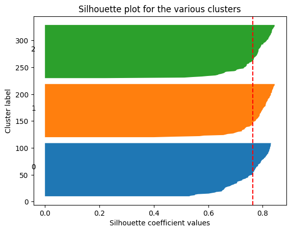
We can do it alternatively
# Compute average silhouette score on different K
sc_av = []
for k in range(2,10):
  kmeans = KMeans(n_clusters=k, n_init=3)
  clusters = kmeans.fit_predict(data)
  sc_av.append(silhouette_score(data, clusters))
sc_df = pd.DataFrame({'k' : range(2, 10),
'Silhouette Coefficient' : sc_av
})
fig2 = px.line(data_frame=sc_df, x='k', y='Silhouette Coefficient', markers='Silhouette Coefficient')
fig2.update_layout(width=500, height=400, title = "Silhouette Coefficient as a function of number of cluster")
fig2.show()The optimal number of clusters should be 3.
2. Hierarchical clustering
Unlike Kmeans algrithm, Hierarchical clustering or hcluster does not require a prior number of clusters. It iteratively merges (agglomerative or bottom up approach) into less and less clusters starting from each points being a cluster on its own, or separate the data point (divisive or top-down approach) to create more and more clusters starting from one clsuter containing all data points.
a. Apply Hirachical cluster on the previously simulated dataset.
from scipy.cluster.hierarchy import dendrogram, linkage
from sklearn.cluster import AgglomerativeClustering

data_linkage = linkage(data, method='ward')
data_linkage[:4,:]
array([[2.12000000e+02, 2.36000000e+02, 1.64158697e-02, 2.00000000e+00],
[2.90000000e+01, 6.00000000e+01, 3.08776001e-02, 2.00000000e+00],
[2.41000000e+02, 2.96000000e+02, 3.85883126e-02, 2.00000000e+00],
[2.08000000e+02, 2.19000000e+02, 4.37418400e-02, 2.00000000e+00]])b. Plot the associated Dendrograms of the resulting groups.
dendrogram(data_linkage)
plt.title("Dendrogram on simulated dataset with 3 clsuters")
plt.show()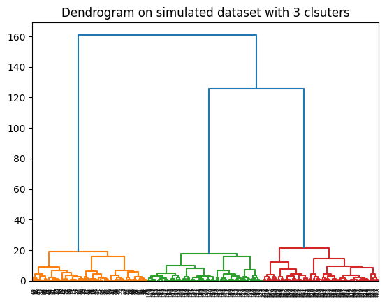
c. Can you decide the most suitable number of clusters from the previous dendrogram?
It’s clear that the optimal number of clusters is 3 where the dendrogram jumped the highest.
import plotly.io as pio
pio.renderers.default = 'notebook'

clust = AgglomerativeClustering(n_clusters=3).fit_predict(data)

import plotly.express as px
fig = px.scatter(x=data[:,0], y=data[:,1], color=[str(i) for i in clust])
fig.update_layout(width=500, height=400, title = "Simulated data with 3 clusters")
fig.show()
3. Real dataset
Now apply both algorithms on Iris dataset imported as follow:
from sklearn.datasets import load_iris

# Load data
Iris = load_iris()
X = Iris.data
y = Iris.target
Using KMeans with Elbow method
K = optimal_clusters(data=X, n_init=3)
print(f"The optimal number of clusters for Iris data is: {K}")
The optimal number of clusters for Iris data is: 2KMeans with Silhouette Scores
import plotly.io as pio
pio.renderers.default = 'notebook'

# Compute average silhouette score on different K
sc_av = []
for k in range(2,10):
  kmeans = KMeans(n_clusters=k, n_init=3)
  clusters = kmeans.fit_predict(X)
  sc_av.append(silhouette_score(X, clusters))

# Silhouette score graph
sc_df = pd.DataFrame({'k' : range(2, 10),
                      'Silhouette Coefficient' : sc_av})
fig2 = px.line(data_frame=sc_df, x='k', y='Silhouette Coefficient', markers='Silhouette Coefficient')
fig2.update_layout(width=500, height=400, title = "Silhouette Coefficient vs K on Iris dataset")
fig2.show()
This also suggests that the optimal number of clusters is 2.
Using Hierarchical Clustering
data_linkage = linkage(X, method='ward')
dendrogram(data_linkage)
plt.title("Dendrogram on Rris Dataset")
plt.show()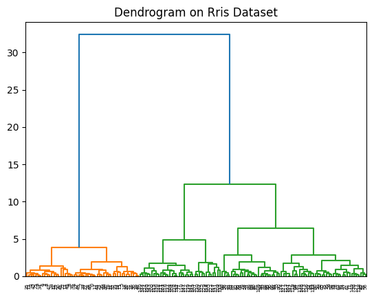
- It’s clear that the optimal number of clusters is also 2 in this case. Let see how the 2 clusters look like by plotting the first two columns of the dataset.
import plotly.io as pio
pio.renderers.default = 'notebook'

clust = AgglomerativeClustering(n_clusters=2).fit_predict(X)
fig = px.scatter(x=X[:,0], y=X[:,1], color=[str(i) for i in clust])
fig.update_layout(width=500, height=400, title = "Iris data with 2 clusters")
fig.show()
But we actually have the true types of Iris follower in the our dataset which is called Iris.target. Let color the data according to the true types of flowers.
import plotly.io as pio
pio.renderers.default = 'notebook'

import plotly.express as px
fig = px.scatter(x=X[:,0], y=X[:,1], color=[str(i) for i in Iris.target])
fig.update_layout(width=500, height=400, title = "Simulated data with 3 clusters")
fig.show()
It seems like there are 3 types of flowers where group 1 and 2 are similar therefore are considered the same group by the algorithm. On the other hand, group 0 is different than the other two groups, so that they are correctly identified as a separate group by the algorithm.
Further Readings
- Kmeansclustering
- Video: Kmean algorithm via vector quantization
- Hirachical clustering
- KMeans, Sklearn
- Hirachical Clustering: AgglomerativeClustering, Sklearn
150