I. Introduction to EDA & Descriptive Statistics


Exploratory Data Analysis & Unsupervised Learning


Lecturer: Dr. HAS Sothea
Instructor: Ms. UANN Sreyvi

0.1 About the course

🎯 Objective:

Equip you with

  • Essential EDA skills to handle, preprocess and uncover insights from data.
  • Key Unsupervised Learning and Multivariate Analysis techniques to apply them to solve real-world problems with proper interpretation.

📝 Grading Criteria

Criteria Attendance Quiz+labs Midterm Final Project
Percentage 10% 20% 20% 20% 30%

💻 Programming: Python

0.2 Course materials

1 Introduction

1.1 Introduction

  • In 60s, someone said “Garbage in, garbage out (GIGO)!”.
Fig 1: GIGO: Garbage In, Garbage Out.
  • This means that low-quality input (data) \(\to\) faulty output or result!

  • Example: problems with real-world data:

    • Missing values in the dataset (e.g., missing salary in a survey).
    • Outliers that can skew the analysis (e.g., extremely high or low values in clinical data).
    • Inconsistent data entry (e.g., “Male”, “male”, “M”).

Introduction

  • Exploratory Data Analysis (EDA) is all about getting curious about your data:
    • Finding out what are the problems.
    • What patterns you can find.
    • What relationships exist in the data.
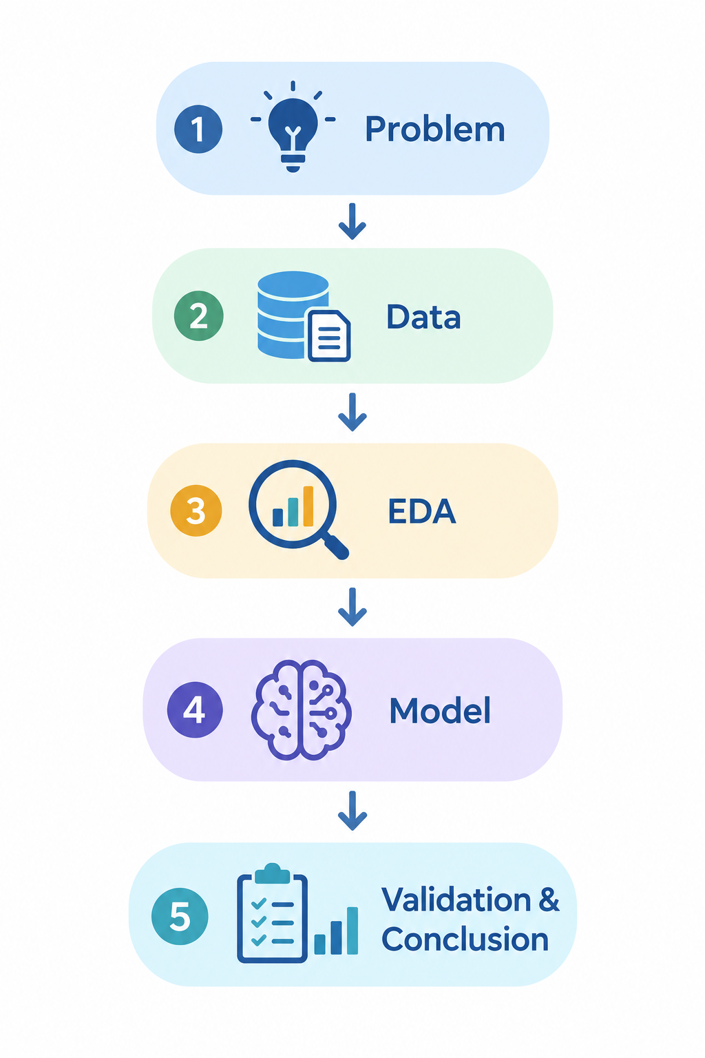
  • It’s the 1st step towards analysis and model building.
Fig 2: EDA is the key step in analyzing the data.
  • If done right, it can help you to
    • Clean the data without damaging the underlying patterns.
    • Formulate further questions and areas for investigation.
    • Uncover aspects of your data that you wouldn’t have seen.
    • Select informative set of inputs for predictive tasks…

Goals of EDA

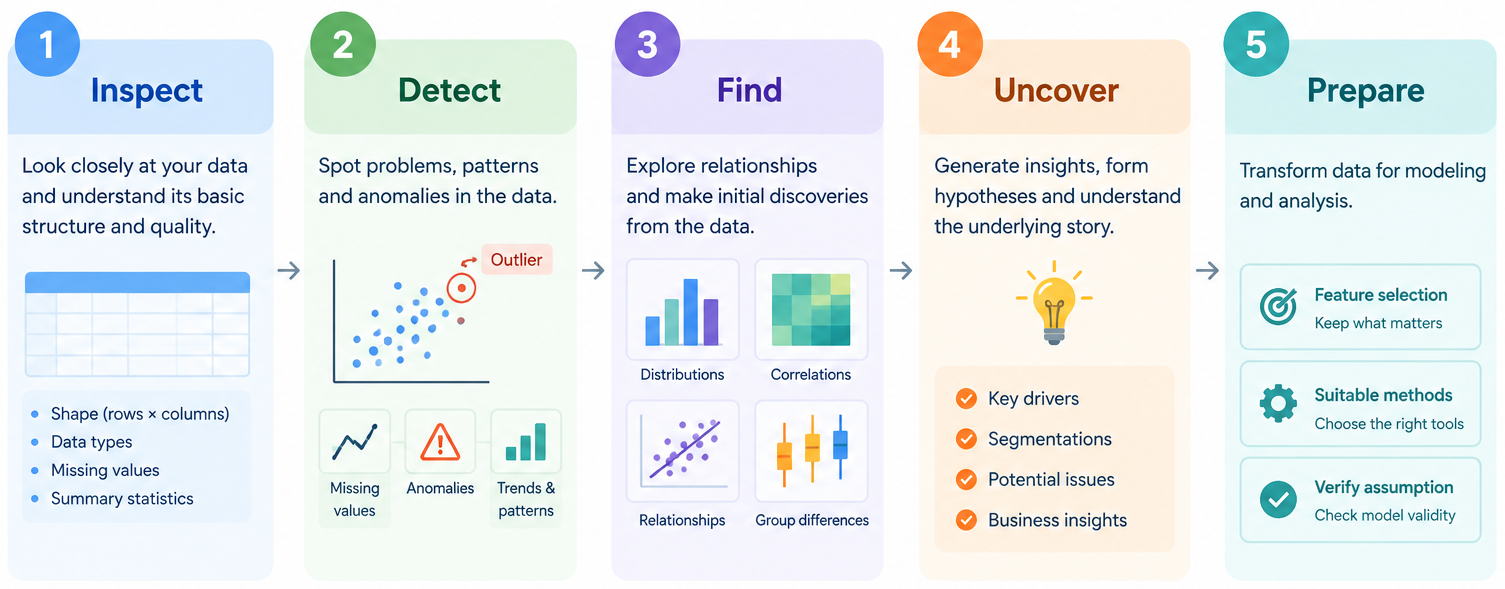
EDA generally involves:

  • Inspect the data.
  • Detect issues.
  • Uncover patterns.
  • Find new aspect for investigation.
  • Prepare for model building:
    • Check assumptions.
    • Select features.
    • Choose appropriate methods.

Descriptive & Inferential Statistics

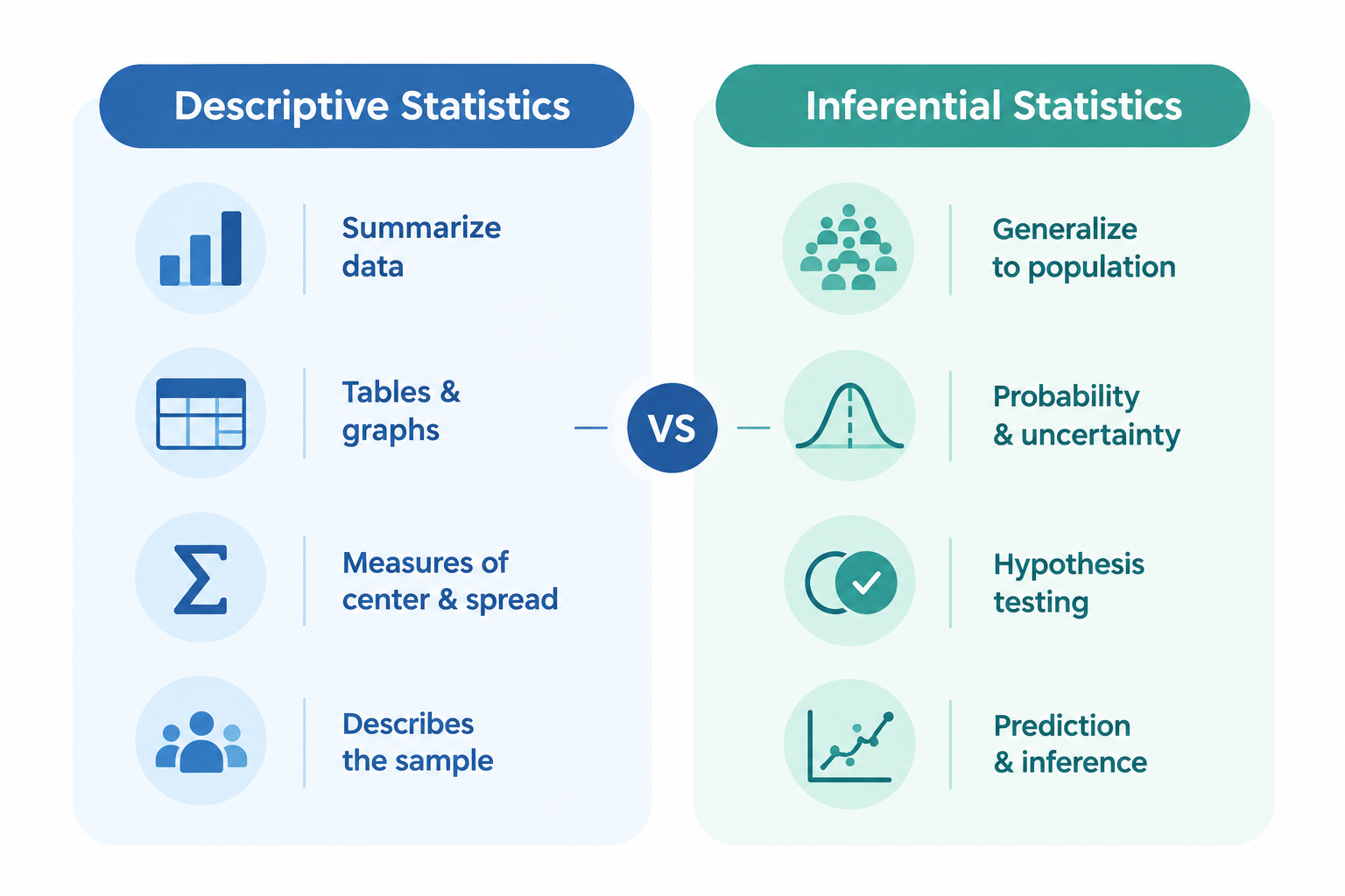
  • Statistics is a branch of mathematics that deals with the collection, analysis, interpretation, presentation, and organization of data.
  • Descriptive statistics focuses on summarizing the data using statistical values and graphs and is needed in EDA for
    • Visualize & understand the data distribution
    • Detecting abnormality/problems in the data
    • Discover pattern/trends…
  • Inferential Statistics infers information analyzed using data to the population by using different hypothesis testing.

1.2 Statistics

Fig 3: Descriptive vs Inferential Statistics.

2 Univariate Analysis

2.1 Motivation

Consider Titanic dataset

Code
import pandas as pd                 # Import pandas package
import seaborn as sns               # Package for beautiful graphs
import matplotlib.pyplot as plt     # Graph management
data = pd.read_csv(path_titanic + "/Titanic-Dataset.csv" ) # Import it into Python
sns.set(style="whitegrid")          # Set grid background
data.drop(columns=['PassengerId']).head()
Survived Pclass Name Sex Age SibSp Parch Ticket Fare Cabin Embarked
0 0 3 Braund, Mr. Owen Harris male 22.0 1 0 A/5 21171 7.2500 NaN S
1 1 1 Cumings, Mrs. John Bradley (Florence Briggs Th... female 38.0 1 0 PC 17599 71.2833 C85 C
2 1 3 Heikkinen, Miss. Laina female 26.0 0 0 STON/O2. 3101282 7.9250 NaN S
3 1 1 Futrelle, Mrs. Jacques Heath (Lily May Peel) female 35.0 1 0 113803 53.1000 C123 S
4 0 3 Allen, Mr. William Henry male 35.0 0 0 373450 8.0500 NaN S
  • First step in analyzing data is understanding each individual column.
    • Did many people survive?
    • Were there more female or male passengers?
    • Does the data contain any anomalies or problems?

2.2 Data Types

Quality vs Quantity

Code
data[['Survived', 'Pclass', 'Age', 'Embarked']].head(3)    # Show 5 first rows
Survived Pclass Age Embarked
0 0 3 22.0 S
1 1 1 38.0 C
2 1 3 26.0 S
  • Column Embarked is clearly different:
    • Performing “\(+\), \(-\)…” doesn’t work!
    • Comparing its values doesn’t work either!
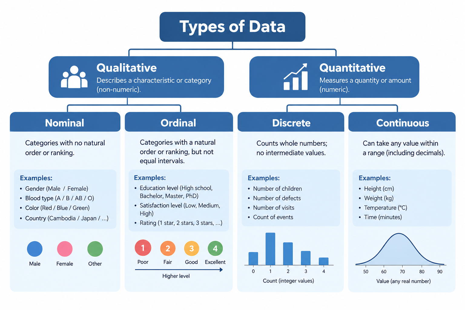
  • Embarked is a Qualitative or Categorical data.
  • Age on the other hand is numerical:
    • Age \(50\) is older than \(30\) (comparison is valid).
    • Age \(20\) is \(5\) years younger than \(25\) or \(25-20=5\).
  • Age is a Quantitative or Numerical data.
  • How about the other two columns 😎?

Summary

Fig 4: Quantitative vs Qualitative data.

Challenge

Code
data[['Sex', 'SibSp', 'Parch', 'Fare']].head()
Sex SibSp Parch Fare
0 male 1 0 7.2500
1 female 1 0 71.2833
2 female 0 0 7.9250
3 female 1 0 53.1000
4 male 0 0 8.0500
  • Q1: Define type of these columns.

Quan Qual
Column Dis Cont Nomi Ordi
Sex ✅
SibSp ✅
Parch ✅
Fare ✅


  • Now, let’s take a closer look!

2.3 Qualitative Data

Statistical values

data[['Pclass', 'Survived', 'Embarked', 'Sex']].head(3)
Pclass Survived Embarked Sex
0 3 0 S male
1 1 1 C female
2 3 1 S female
  • What values should we use to describe qualitative data?

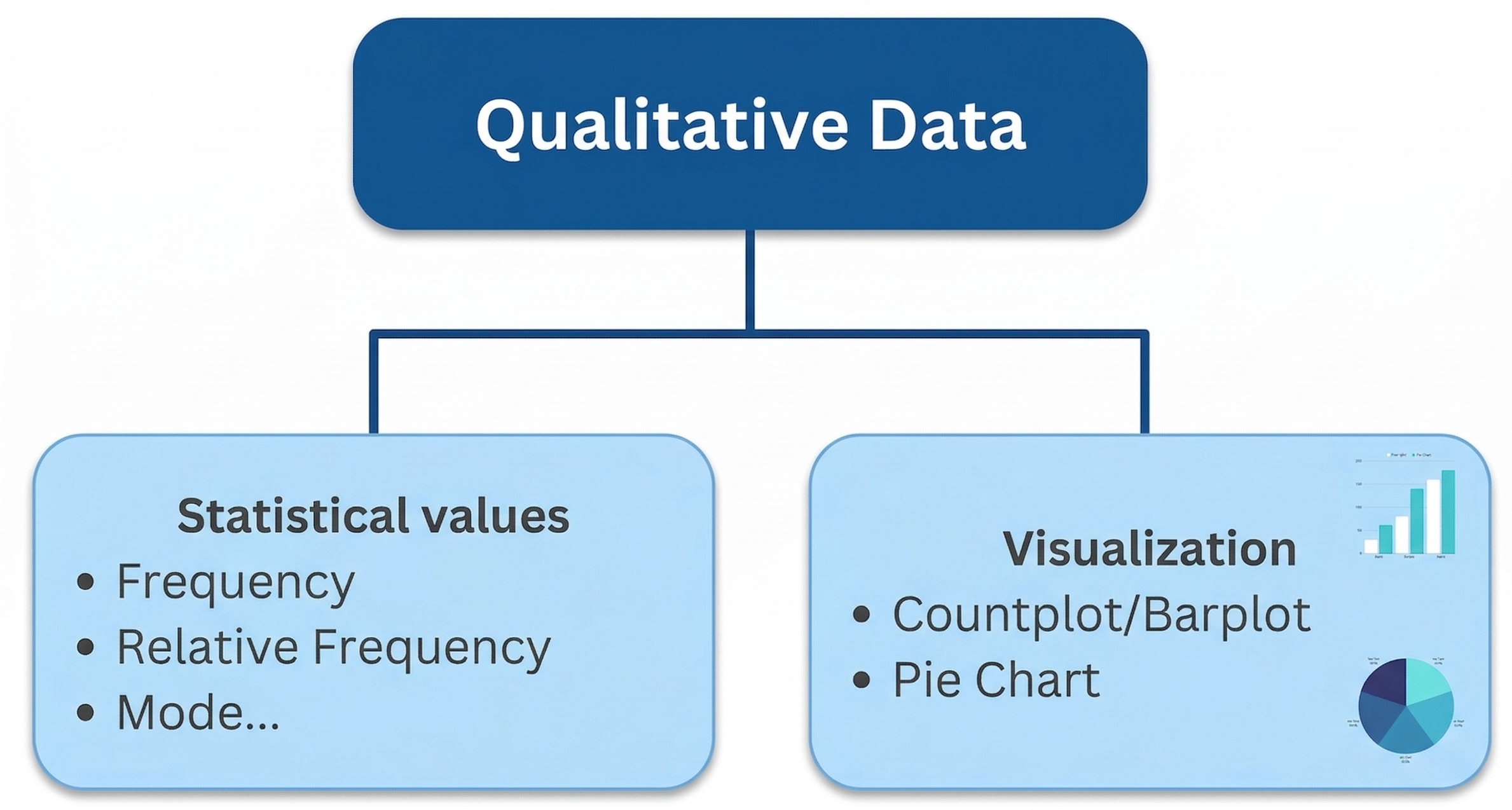
  • Absolute Frequency: Number of occurrences/counts of each category.

  • Relative Frequency: proportion/percentage of each category.

  • Mode: Category with highest frequency/count.

  • Example:
Code
freq_tab = data[['Pclass']].value_counts().to_frame().round()
freq_tab['proportion'] = data[['Pclass']].value_counts(normalize=True).round(2)
freq_tab.T
Pclass 3 1 2
count 491.00 216.00 184.00
proportion 0.55 0.24 0.21

Code
freq_tab = data[['Sex']].value_counts().to_frame()
freq_tab['proportion'] = data[['Sex']].value_counts(normalize=True).round(2)
freq_tab.T
Sex male female
count 577.00 314.00
proportion 0.65 0.35

Visualization

data[['Pclass', 'Survived', 'Embarked', 'Sex']].head(5)
Pclass Survived Embarked Sex
0 3 0 S male
1 1 1 C female
2 3 1 S female
3 1 1 S female
4 3 0 S male
  • What graph should we use to present qualitative data?
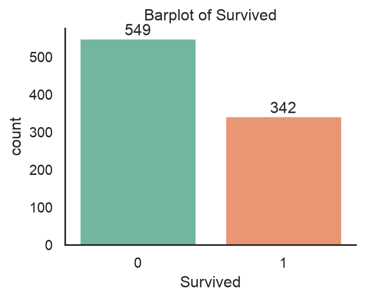
  • Countplot/Barplot: Represent each count/proportion by a bar.
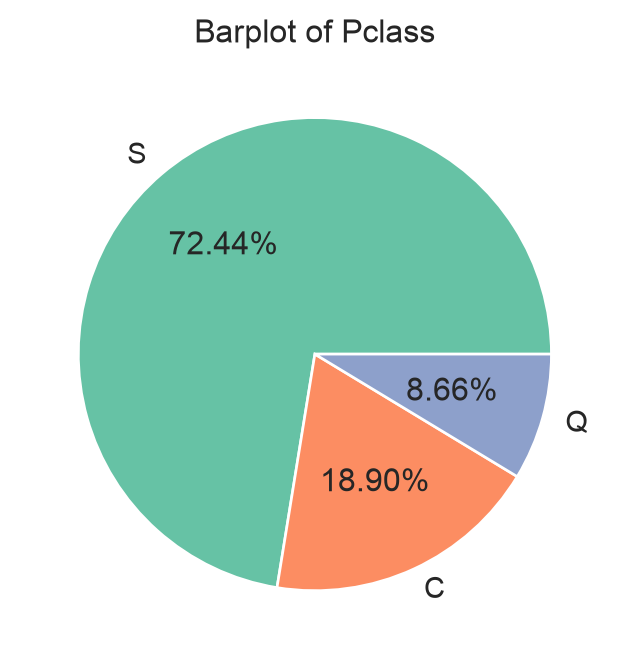
  • Pie chart: Represent count/proportion by circular slices, \[\theta_j=\frac{n_j}{n}\times 360^\circ\text{ for each category }j.\]
  • Example:
import matplotlib.pyplot as plt
import seaborn as sns  # For graph
plt.figure(figsize=(4,2))
ax = sns.countplot(data, 
    x="Survived", 
    palette="Set2") # create graph
ax.set_title("Barplot of Survived") # add title
ax.bar_label(ax.containers[0]) # add number to bars
ax.bar_label(ax.containers[1]) # add number to bars
plt.tight_layout()
plt.show() # Show graph

import matplotlib.pyplot as plt
import seaborn as sns  # For graph
color_palette = sns.color_palette("Set2") # set color palette
plt.figure(figsize=(5,4))
tab = data['Embarked'].value_counts() # Compute 
plt.pie(tab, labels=tab.index, 
    autopct='%0.2f%%', 
    colors=color_palette) # graph
plt.title("Barplot of Pclass") # add title
plt.show() # Show graph

⚠️ Pie charts can be challenging when many categories have similar proportions.

Summary

Fig 5: Statistical values and graph for qualitative data.

2.4 Quantitative Data

Statistical values: Quantiles

data[['Age', 'Fare', 'SibSp', 'Parch']].head(3)
Age Fare SibSp Parch
0 22.0 7.2500 1 0
1 38.0 71.2833 1 0
2 26.0 7.9250 0 0
  • What values should we use to describe quantitative data?

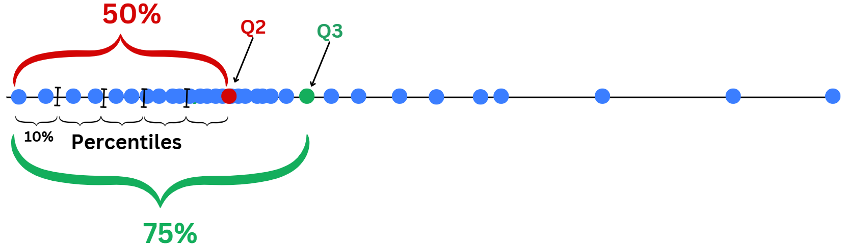
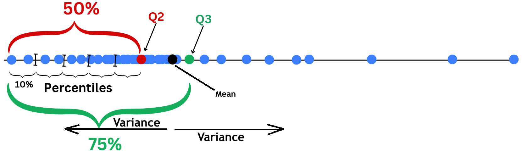
  • Quantiles: For data sorted in ascending order, the cut points divide the range into contiguous proportion intervals.

Different types of quantile:

  • Percentiles: Values that divide data into 100 equal parts.
  • Quartiles: The 25th (Q1), 50th (Q2 or median), and 75th (Q3) percentiles.

min 25% 50% 75% max
Fare 0.00 7.91 14.45 31.0 512.33
Age 0.42 20.12 28.00 38.0 80.00

Statistical values: Quartile computation

Method to find Quartiles:

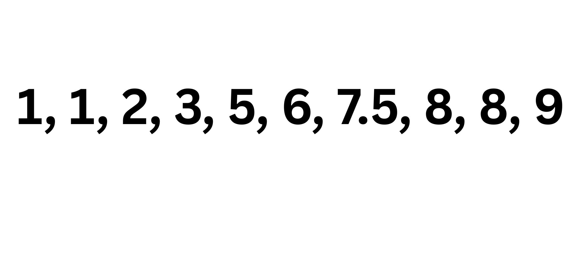
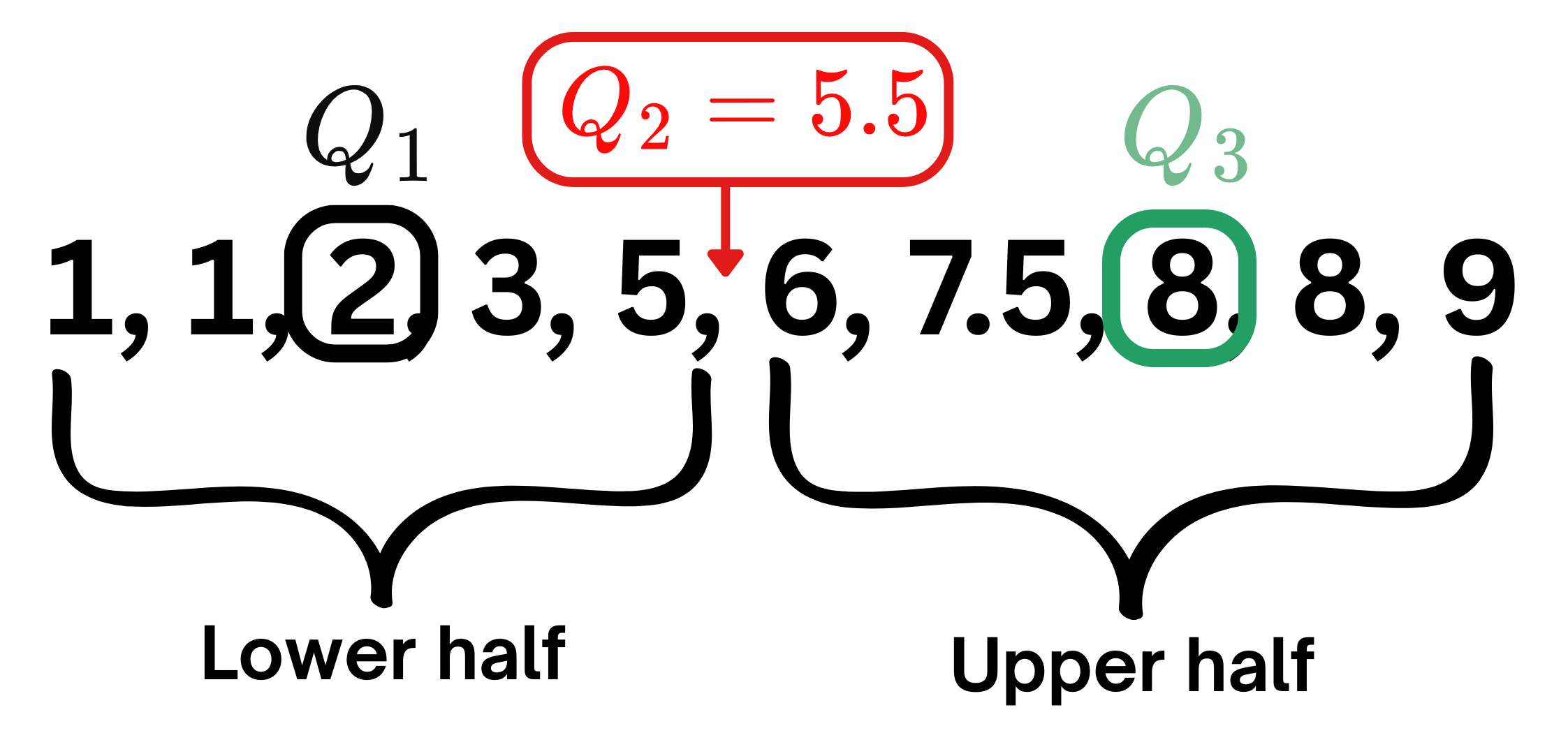
  • Sort the data in ascending order: \(X_1,...,X_n\).

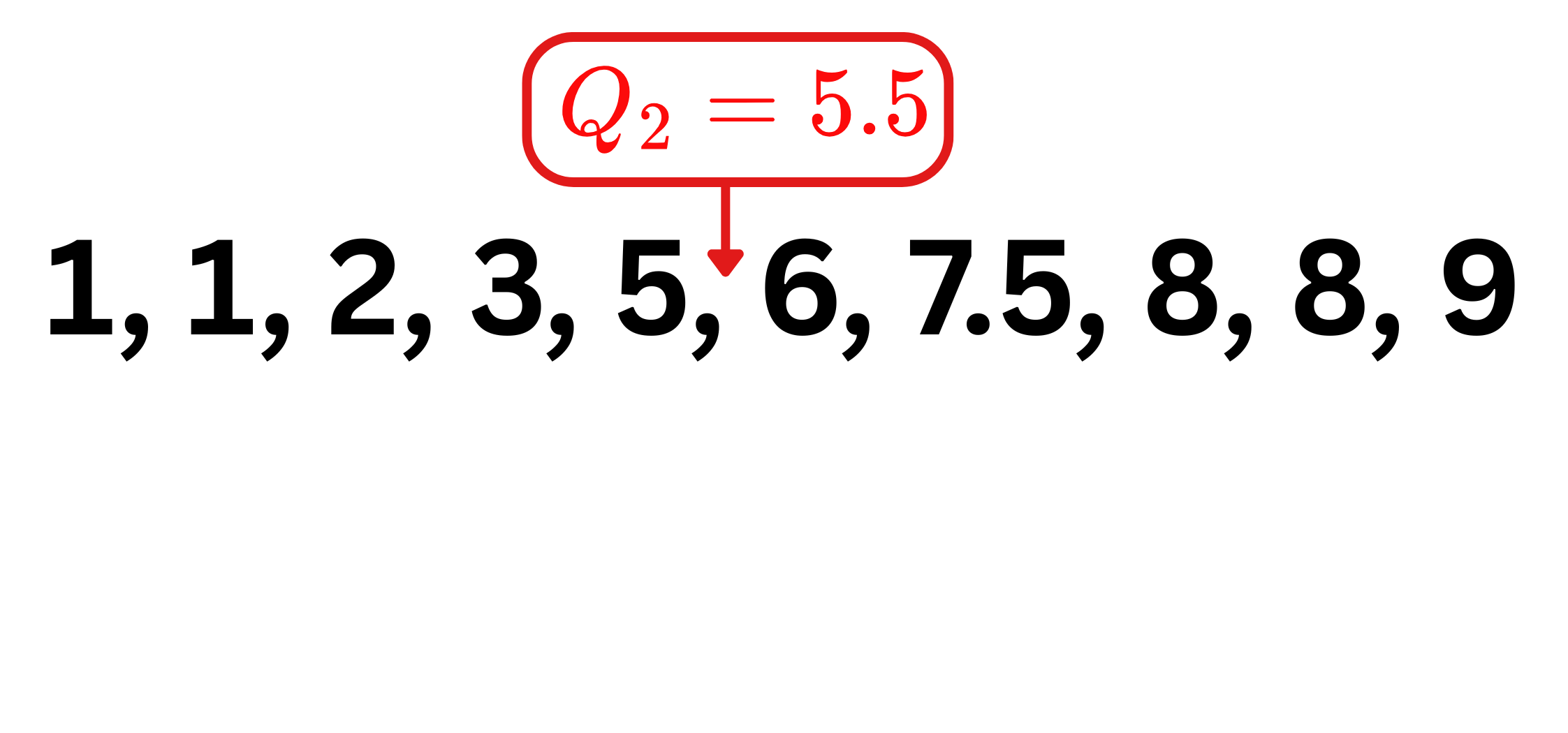
  • If \(n\) is odd: \(\color{red}{Q_2}=X_{(n+1)/2}\) “middle term”.
  • If \(n\) is even: \(\color{red}{Q_2}=\frac{X_{(n/2)}+X_{(n/2)+1}}{2}\) “middle value”.
  • \(Q_1\): the middle point of the lower-half data.
  • \(\color{green}{Q_3}\): the middle point of the upper-half data.

Different types of quantile:

  • Percentiles: Values that divide data into 100 equal parts.
  • Quartiles: The 25th (Q1), 50th (Q2 or median), and 75th (Q3) percentiles.

min 25% 50% 75% max
Fare 0.00 7.91 14.45 31.0 512.33
Age 0.42 20.12 28.00 38.0 80.00

Statistical values: Mean/average

data[['Age', 'Fare', 'SibSp', 'Parch']].head(3)
Age Fare SibSp Parch
0 22.0 7.2500 1 0
1 38.0 71.2833 1 0
2 26.0 7.9250 0 0
  • Mean: Average over all points:

\[\color{blue}{\overline{X}=\frac{1}{n}\sum_{i=1}^nX_i=\frac{X_1+\dots+X_n}{n}}.\]

  • Remark: Mean is sensitive and has tendency towards outliers. In such cases, the median (Q2) may provide a better measure of central tendency.

Different types of quantile:

  • Percentiles: Values that divide data into 100 equal parts.
  • Quartiles: The 25th (Q1), 50th (Q2 or median), and 75th (Q3) percentiles.

min 25% 50% 75% max
Fare 0.00 7.91 14.45 31.0 512.33
Age 0.42 20.12 28.00 38.0 80.00
mean min 25% 50% 75% max
Fare 32.2 0.00 7.91 14.45 31.0 512.33
Age 29.7 0.42 20.12 28.00 38.0 80.00
  • Fare: Mean >> Q2 suggesting extremely large outliers (some passengers paid very high fares).

Statistical values: Variance/Std

data[['Age', 'Fare', 'SibSp', 'Parch']].head(3)
Age Fare SibSp Parch
0 22.0 7.2500 1 0
1 38.0 71.2833 1 0
2 26.0 7.9250 0 0
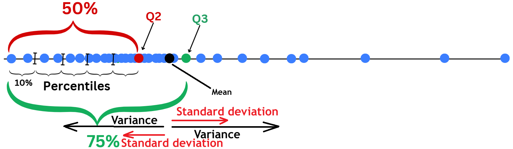
  • There are two main Measures of Dispersion for describing how data points are spread out from the Mean.
  • Sample variance: average of squared distances of data points from the Mean.

\[\color{blue}{\widehat{\sigma}^2=\frac{1}{n-1}\sum_{i=1}^n(X_i-\overline{X})^2}.\]

  • Sample standard deviation (std): Just the square root of Variance.

\[\color{blue}{\widehat{\sigma}=\sqrt{\widehat{\sigma}^2}=\sqrt{\frac{1}{n-1}\sum_{i=1}^n(X_i-\overline{X})^2}}.\]

Examples:

var = data[['Age','Fare']].var().to_frame().round(5)
var.columns = ['Var']
var.T
Age Fare
Var 211.01912 2469.43685
  • Large variance means that data points are widely spread out from the Mean.
std = data[['Age','Fare']].apply(['var', 'std'])
std
Age Fare
var 211.019125 2469.436846
std 14.526497 49.693429
  • Std is more interpretable than variance because it has the same unit as \(X_i\).

Intuition of Variance and Standard Deviation.

Statistical Summary

Age Fare SibSp Parch
0 22.0 7.2500 1 0
1 38.0 71.2833 1 0
2 26.0 7.9250 0 0

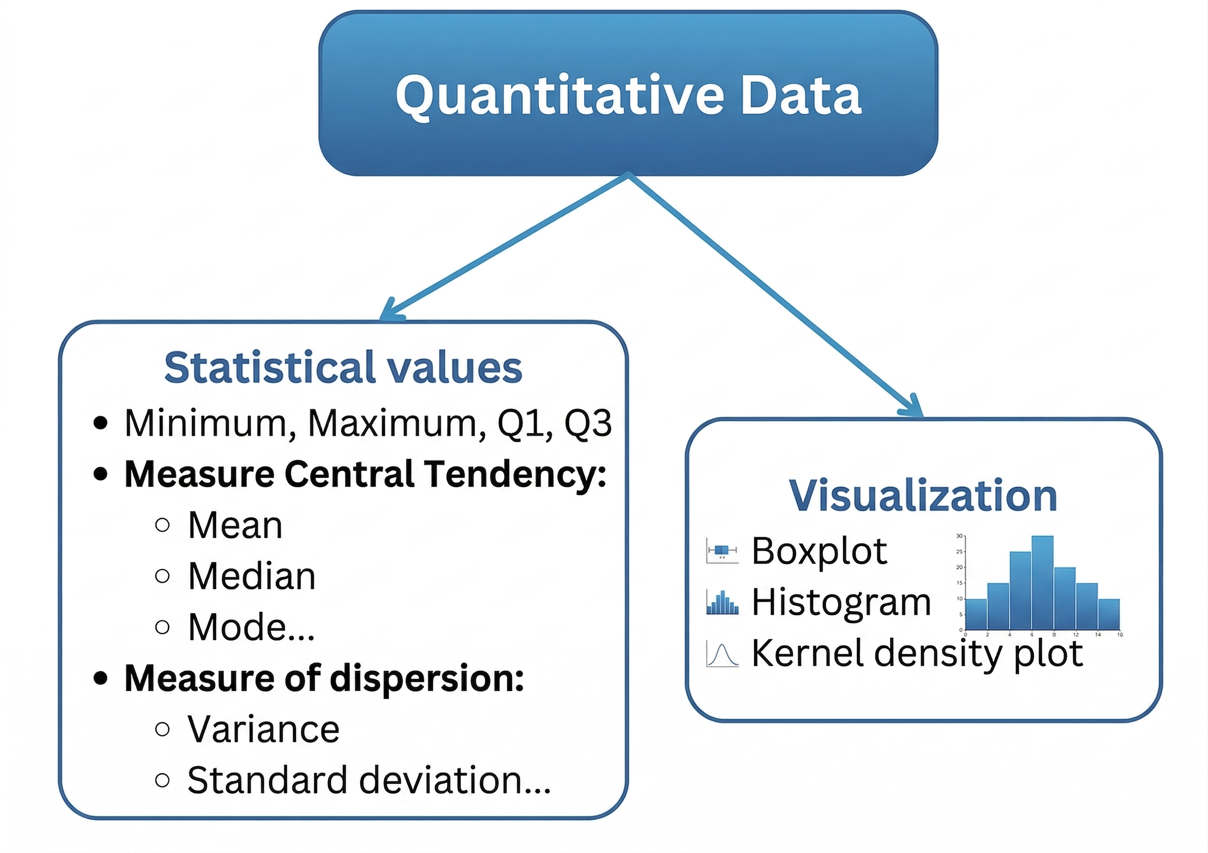
Statistical summary uses all key values to help us understand how the data is distributed and detect any potential problems with it.

  • Where the data is concentrated (mean/median)?
  • How spread out it is (var/std)?
  • Any extreme values (mean vs median)?
  • Any invalid values (min/max)?

Examples:

data[['Age','Fare']]\
        .describe().drop('count')  # for summary
Age Fare
mean 29.699118 32.204208
std 14.526497 49.693429
min 0.420000 0.000000
25% 20.125000 7.910400
50% 28.000000 14.454200
75% 38.000000 31.000000
max 80.000000 512.329200

Visualization: Boxplot

Age Fare SibSp Parch
0 22.0 7.2500 1 0
1 38.0 71.2833 1 0
2 26.0 7.9250 0 0
3 35.0 53.1000 1 0
4 35.0 8.0500 0 0
5 NaN 8.4583 0 0
6 54.0 51.8625 0 0

  • Boxplots describe the data distribution using Quartiles and the range where data normally fall within:
    • Lower and upper part of the box are \(Q_1\) and \(\color{green}{Q_3}\).
    • Median \(\color{red}{Q_2}\) is the middle line.
    • Interquartile range: \(\text{IQR}=\color{green}{Q_3}-Q_1\) (gap of \(50\%\) most important part of the data).
    • Range: \([Q_1-1.5\text{IQR},\color{green}{Q_3}+1.5\text{IQR}]\). If the data are normally distributed, \(99.3\%\) of data fall within this range.
    • Outliers: data points that fall outside of the range.

Visualization: Boxplot (Example)

Age Fare SibSp Parch
0 22.0 7.2500 1 0
1 38.0 71.2833 1 0
2 26.0 7.9250 0 0
3 35.0 53.1000 1 0
4 35.0 8.0500 0 0
5 NaN 8.4583 0 0
Code
import plotly.express as px
fig = px.box(data, x="Fare")
fig.update_layout(height=200,
                  width=450,
                  title="Boxplot of Fare")
fig.show()
  • Boxplots describe the data distribution using Quartiles and the range where data normally fall within:
    • Lower and upper part of the box are \(Q_1\) and \(\color{green}{Q_3}\).
    • Median \(\color{red}{Q_2}\) is the middle line.
    • Interquartile range: \(\text{IQR}=\color{green}{Q_3}-Q_1\) (gap of \(50\%\) most important part of the data).
    • Range: \([Q_1-1.5\text{IQR},\color{green}{Q_3}+1.5\text{IQR}]\). If the data are normally distributed, \(99.3\%\) of data fall within this range.
    • Outliers: data points that fall outside of the range.
  • Fares range from \(£0\) to maximum fare of \(£512.33\).
  • \(Q_1=£7.9\) indicating that around \(25\%\) of passengers spent less than \(£7.9\) to get to the ship.
  • \(\color{red}{Q_2}=£14.45\) (Median): around \(50\%\) spent less than \(£14.45\).
  • \(\color{green}{Q_3}=£31\): around \(75\%\) spent less than \(£31\).
  • Outliers: Passengers who spent more than the upper fence (\(£65\)), with the largest fare of \(£512.33\).

Visualization: Histogram

Code
import plotly.express as px

# Calculate the mean and median
mean_age = data["Age"].mean()
median_age = data["Age"].median()

# Create the base histogram
fig = px.histogram(data, x="Age")

# Add a vertical dashed line for the Mean
fig.add_vline(
    x=mean_age, 
    line_dash="dash", 
    line_color="red", 
    annotation_text=f"Mean: {mean_age:.1f}", 
    annotation_position="top right"
)

# Add a vertical dashed line for the Median
fig.add_vline(
    x=median_age, 
    line_dash="dash", 
    line_color="green", 
    annotation_text=f"Median: {median_age:.1f}", 
    annotation_position="top left"
)

# Apply your layout settings
fig.update_layout(
    height=220, 
    width=500, 
    title="Histogram of Age"
)

fig.show()
  • A histogram is constructed by:
    • Defining a grid range of bins: \(B_1, \dots, B_N\).
    • The height of each bar represents the count/frequency of \(X_i\) values that fall within the corresponding bin.

Mathematical definition of histogram

  • Define bins: \(B_1,\dots, B_N\).
  • For any \(x\) such that \(x\in B_k\) for some \(k\),

\[\text{hist}(x)=\sum_{i=1}^n\mathbb{1}_{\{X_i\in B_k\}}.\]

where \(\mathbb{1}_{\{X_i\in B_k\}}\) is an indicator function that equals \(1\) if \(X_i\) falls within the bin \(B_k\), and \(0\) otherwise.

Visualization: Kernel Density Plot (KDE)

Code
import plotly.figure_factory as ff
age = [data[['Age']].dropna().values.reshape(-1)]
group_labels = ['distplot']
fig = ff.create_distplot(age, group_labels=group_labels, bin_size=1.9)
fig.update_layout(height=220, 
                  width=500, 
                  title="Histogram of Age")
fig.show()
  • A Kernel Density Plot is a smooth, continuous version of a histogram.
  • It describes the relative frequency of observations over ranges of values.
  • It has nicer mathematical properties than histograms.

Mathematical definition of KDE

  • If \(K\) is a smooth kernel function, for example: \(K(x)=e^{-x^2/2}\).
  • For a given \(h>0\) and for any \(x\):

\[\text{kde}(x)=\frac{1}{nh}\sum_{i=1}^nK\Big(\frac{x-X_i}{h}\Big).\]


  • Kernel density plot conveys similar information as histograms.
  • It highlights common ranges of values and patterns in the data.

Summary

  • Univariate analysis aims at describing, understanding and detecting potential problems in the data by looking at each variable separately.
  • Descriptive statistics and visualization are the two main tools for univariate analysis.

Qualitative columns of Titanic Dataset

Code
qual_var = ['Survived', 'Pclass', 'Sex']
import plotly.express as px
import plotly.graph_objects as go
from plotly.subplots import make_subplots
fig = make_subplots(
    rows=3, cols=1, 
    specs=[[{"type": "bar"}], [{"type": "bar"}], [{"type": "bar"}]],
    subplot_titles=("Barplot of Survived", "Barplot of Pclass ", "Barplot Sex"))
for i, va in enumerate(qual_var):
    cnt = data[va].value_counts()
    if i == 0:
        fig.add_trace(
            go.Bar(x=list(cnt.index.astype(str)), y=list(cnt.values), name=va), col=1, row=i+1)
    else:
        fig.add_trace(
            go.Bar(x=list(cnt.index.astype(object)), y=list(cnt.values), name=va), col=1, row=i+1)
fig.update_layout(height=450, width=450)
fig.show()
Code
fig = make_subplots(
    rows=3, cols=1, 
    specs=[[{"type": "pie"}], [{"type": "pie"}], [{"type": "pie"}]],
    subplot_titles=("Pie chart of Survived", "Pie chart of Pclass ", "Pie chart Sex"))
for i, va in enumerate(qual_var):
    cnt = data[va].value_counts()
    fig.add_trace(go.Pie(labels=list(cnt.index.astype(object)), values=list(cnt.values)), col=1, row=i+1)
fig.update_layout(height=450, width=450)
fig.show()

Quantitative columns

Code
quan_var = ['Age', 'SibSp', 'Parch', 'Fare']
cols = ['#C96451', '#80C96F', '#6B7FDB', '#C07EDE']
fig = make_subplots(
    rows=2, cols=4,
    subplot_titles=("Distribution of Age", "Distribution of Parch", "Distribution of SibSp", "Distribution of Fare", "","","",""))
for i, va in enumerate(quan_var):
    fig.add_trace(
        go.Box(x=data[va].values, name=va, marker_color = cols[i]), col=i+1, row=1)
    fig.add_trace(
        go.Histogram(x=data[va].values, name=va, marker_color = cols[i]), col=i+1, row=2)
fig.update_layout(height=450, width=1000)
fig.show()

Quantitative columns (log scale)

Code
quan_var = ['Age', 'SibSp', 'Parch', 'Fare']
cols = ['#C96451', '#80C96F', '#6B7FDB', '#C07EDE']
fig = make_subplots(
    rows=2, cols=4,
    subplot_titles=("Distribution of Age", "Distribution of Parch", "Distribution of SibSp", "Distribution of log(Fare)", "","","",""))
for i, va in enumerate(quan_var):
    fig.add_trace(
        go.Box(x=data[va].values, name=va, marker_color = cols[i]), col=i+1, row=1)
    fig.add_trace(
        go.Histogram(x=data[va].values, name=va, marker_color = cols[i]), col=i+1, row=2)
fig.update_layout(height=450, width=1000)
fig.update_xaxes(type="log", row=1, col=4)
fig.update_yaxes(type="log", row=2, col=4)
fig.show()


2.5 More on Descriptive Statistics


🥳 Yeahhhh….


Party time… 🥂