#%pip install gapminder           # This is for installing the package
from gapminder import gapminder
import pandas as pd
import numpy as np
gapminder.head()TP2 - Bivariate Analysis
Exploratory Data Analysis & Unsuperivsed Learning
Course: Dr. HAS Sothea
TP: Dr. PHAUK Sokkey
Ms. UANN Sreyvi
Objective: To equip you all with the skills to analyze and interpret the relationship between two variables. You will explore these relationships as a function of time using the Gapminder dataset.
The
Jupyter Notebookfor this TP can be downloaded here: TP2-Bivariate-Gapminder.
1. Pearson and Spearman’s correlations
a. Compute Pearson correlation matrix of the three quantitative variables on year \(1952\), \(1987\) and then \(2007\) using pd.corr(). Give a brief intuition of the relationship between these variables.
# To doDescription:
b. Compute Spearman’s Rank Correlation of the previous columns in 1952, 1987 and 2007. What do you observe?
# To doc. From the previous result, pick the most interesting pair of variables and plot a graph illustrating their relationship on each year, using proper axis scaling and title.
# To dod. Revisit your intuition of the correlation matrix in year 1952 from question (a), can you see why we observed such a (poor) correlation in 1952?!
- Now, drop the weird country of year 1952. Revisualize and recompute the correaltion between
healthandeconomycondition of the world in 1952. Conclude.
Remark: Pearson correlation matrix can summarize linear relationship between pairs of quantitative variables but it might be inacurate and influenced by
- outliers,
- non-linearity,
- small sample size,
- confounding (causal) variables…
2. Visualization with more information
Scatterplot is the primary graphic type for visualizing the relationship between two quantitative variables. Additionally, you can include other factors of interest using color, shape, size, facets, etc., depending on the type of those variables.
The following questions apply to the years 1952, 1987, and 2007:
a. Do you think health conditions and economies differ across continents? Compute some indicators to illustrate this.
# To dob. Visualize the previous claim using conditional distribution. Hint: plot distribution of each continuous variable on each continent.
# To doDescription:
c. We will try to confirm this using Analysis of Variance (ANOVA).
In 2007,
- Perform one way ANOVA on
lifeExpandcontinent(you can usef_onewayfromscipy.statsmodule).
from scipy.stats import f_oneway
# To do- Do the same with
gdpPercapandcontinent.
# To do- Are these results reliable? Why?
Your response:
- Propose ideas that might solve this problem or an alternative method.
Your response:
d. We have previously described the relationship between population and life expectancy or GDP per capita. Now, illustrate the effect of population defining size of points according to variable pop.
# To doe. Now, directly visualize the relation between pop and lifeExp, then the relation between pop and gdpPercap. Explain the resulting graphs.
# To do3. Quantitative vs Qualitative
a. We have seen how life expectancy and economy vary across continents in 2007 (Slide 25 of the course). Compute \(\eta\)-squared correlation between continent and lifeExp, then continent with gdpPercap in 1952, 1987 and 2007.
- Do you find the results reasonable?
# To do4. Time evolution
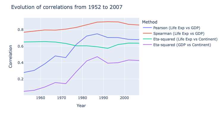
a. Draw the evolution of the following correaltions from 1952 to 2007:
PersonandSpearmancorerlation between life expectancy and GDP per capita- \(\eta\)-squared coefficients of continent vs life expectancy, and continents vs GDP per capita.
Hint: the following figure is expected.
import plotly.io as pio
pio.renderers.default = 'notebook'
import plotly.express as px

# To do
b. Describe what you observed: the world from 1952 to 2007.
Description:
Further readings
- Gapminder documentation: https://www.gapminder.org/data/documentation/
- A short demonstration video is available here: Hans Rosling’s 200 Countries, 200 Years, 4 Minutes - The Joy of Stats - BBC Four.
- Graphical tools: