import kagglehub
# Download latest version
path = kagglehub.dataset_download("fedesoriano/stroke-prediction-dataset")TP8 - Multiple Corresponding Analysis (CA)
Exploratory Data Analysis & Unsuperivsed Learning
Course: PHAUK Sokkey, PhD
TP: HAS Sothea, PhD
Objective: “In the previous TP, we studied Correspondence Analysis (CA), which can be used to analyze the association between two qualitative variables. In this TP, we extend this to the more general case of Multiple Correspondence Analysis (MCA), which is used to study the association of multiple variables in an indicator or a Burt matrix or survey.
The
Jupyter Notebookfor this TP can be downloaded here: TP8_MCA.ipynb.
1. Kaggle Stroke Dataset
A stroke occurs when the blood supply to part of the brain is interrupted or reduced, preventing brain tissue from getting oxygen and nutrients. Brain cells begin to die within minutes. Strokes can be classified into two main types: ischemic stroke, caused by a blockage in an artery, and hemorrhagic stroke, caused by a blood vessel leaking or bursting. Immediate medical attention is crucial to minimize brain damage and potential complications (see, Mayo Clinic and WebMD).
The Kaggle Stroke Prediction Dataset (available here) is designed to predict the likelihood of a stroke based on various health parameters. We will analysze this asssociation using MCA.
The Stroke dataset dataset can be imported from kaggle as follow.
# Import data
import pandas as pd
data = pd.read_csv(path + "/healthcare-dataset-stroke-data.csv")
data.head()| id | gender | age | hypertension | heart_disease | ever_married | work_type | Residence_type | avg_glucose_level | bmi | smoking_status | stroke | |
|---|---|---|---|---|---|---|---|---|---|---|---|---|
| 0 | 9046 | Male | 67.0 | 0 | 1 | Yes | Private | Urban | 228.69 | 36.6 | formerly smoked | 1 |
| 1 | 51676 | Female | 61.0 | 0 | 0 | Yes | Self-employed | Rural | 202.21 | NaN | never smoked | 1 |
| 2 | 31112 | Male | 80.0 | 0 | 1 | Yes | Private | Rural | 105.92 | 32.5 | never smoked | 1 |
| 3 | 60182 | Female | 49.0 | 0 | 0 | Yes | Private | Urban | 171.23 | 34.4 | smokes | 1 |
| 4 | 1665 | Female | 79.0 | 1 | 0 | Yes | Self-employed | Rural | 174.12 | 24.0 | never smoked | 1 |
A. Perform data preprocessing to ensure that the columns are in correct types, clean and complete for further analysis.
- Data types
data = data.drop(columns=['id'])
data.describe()| age | hypertension | heart_disease | avg_glucose_level | bmi | stroke | |
|---|---|---|---|---|---|---|
| count | 5110.000000 | 5110.000000 | 5110.000000 | 5110.000000 | 4909.000000 | 5110.000000 |
| mean | 43.226614 | 0.097456 | 0.054012 | 106.147677 | 28.893237 | 0.048728 |
| std | 22.612647 | 0.296607 | 0.226063 | 45.283560 | 7.854067 | 0.215320 |
| min | 0.080000 | 0.000000 | 0.000000 | 55.120000 | 10.300000 | 0.000000 |
| 25% | 25.000000 | 0.000000 | 0.000000 | 77.245000 | 23.500000 | 0.000000 |
| 50% | 45.000000 | 0.000000 | 0.000000 | 91.885000 | 28.100000 | 0.000000 |
| 75% | 61.000000 | 0.000000 | 0.000000 | 114.090000 | 33.100000 | 0.000000 |
| max | 82.000000 | 1.000000 | 1.000000 | 271.740000 | 97.600000 | 1.000000 |
quan_col = ["age", "avg_glucose_level", "bmi"]
for va in data.columns:
if va not in quan_col:
data[va] = data[va].astype(object)data.dtypesgender object
age float64
hypertension object
heart_disease object
ever_married object
work_type object
Residence_type object
avg_glucose_level float64
bmi float64
smoking_status object
stroke object
dtype: object- Missing values
data.isna().sum(), data.shape(gender 0
age 0
hypertension 0
heart_disease 0
ever_married 0
work_type 0
Residence_type 0
avg_glucose_level 0
bmi 201
smoking_status 0
stroke 0
dtype: int64,
(5110, 11))import seaborn as sns
sns.set(style="whitegrid")
import matplotlib.pyplot as plt
_, axs = plt.subplots(2, 3, figsize=(12, 6))
for i, va in enumerate(quan_col):
sns.histplot(data, x=va, ax=axs[0,i])
axs[0,i].set_title(f"Distribution of {va} before removing NA")
sns.histplot(data.dropna(), x=va, ax=axs[1,i])
axs[1,i].set_title(f"Distribution of {va} after removing NA")
plt.tight_layout()
plt.show()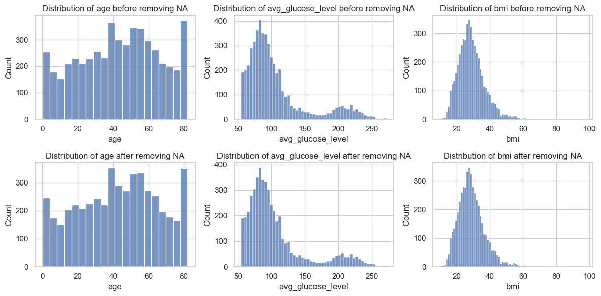
qual_cols = data.select_dtypes(include='object').columns
_, axs = plt.subplots(2, len(qual_cols), figsize=(22, 6))
for i, va in enumerate(qual_cols):
sns.countplot(data, x=va, ax=axs[0,i])
axs[0,i].set_title(f"{va} before removing NA")
sns.countplot(data.dropna(), x=va, ax=axs[1,i])
axs[1,i].set_title(f"{va} after removing NA")
if len(axs[0,i].containers[0])> 3:
axs[0,i].tick_params(labelrotation=45)
axs[1,i].tick_params(labelrotation=45)
plt.tight_layout()
plt.show()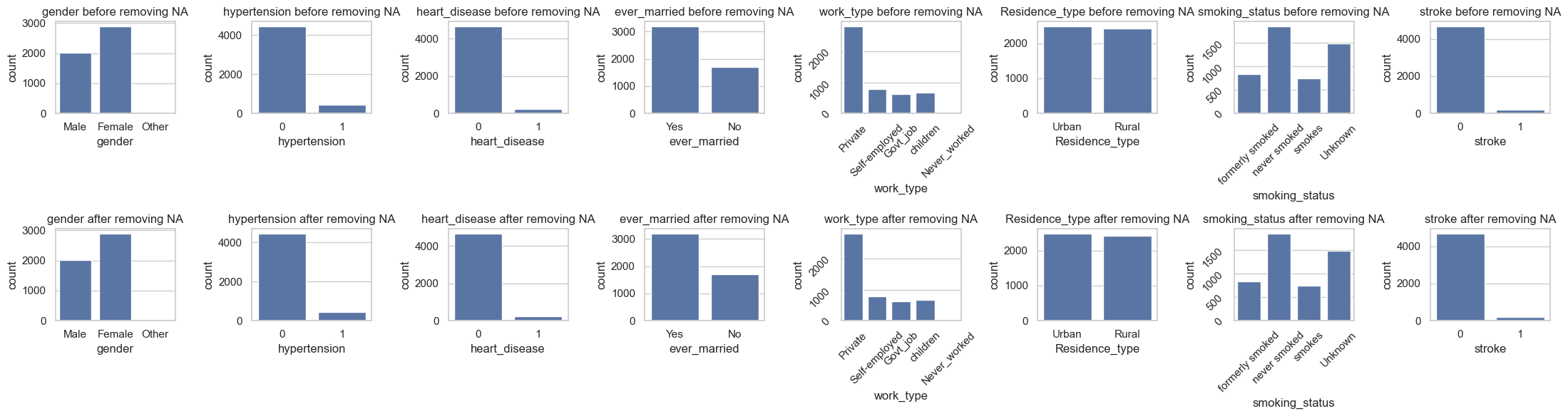
According to the analysis, the missing values are “Completely At Random (MCAR)”, therefore we can drop them or impute them with some constant.
data = data.dropna()
data = data.drop_duplicates()B. Recall that in CA (or even MCA), if \(X\in\mathbb{R}^{n\times m}\) is the design matrix, let \(Z=X/n\) be the normalized matrix. The row and column marginal relative frequencies are given by \(\textbf{r}=Z\mathbb{1}_{m}\) and \(\textbf{c}=\mathbb{1}_{n}Z\) where \(\mathbb{1}_d\) denotes a \(d\times d\) matrix with all elements equal to 1. Let the row and column weights \(D_r=\text{diag}(\textbf{r})\) and \(D_c=\text{diag}(\textbf{c})\), then the factor scores are obtained from the following singular value decomposition:
\[D_r^{-1/2}(Z-\textbf{r}\textbf{c}^T)D_c^{-1/2}=UD V^T,\]
where \(D\) is the diagonal matrix of sigular values with \(\Sigma=D^2\) are the eigenvalues. The row and column scores are given by: \[F=D_r^{-1/2}UD\quad\text{and}\quad G=D_c^{-1/2}VD,\] which are the scores represented on the principal axes with respect to \(\chi^2\)-distance.
With Stroke dataset,
Perform MCA on this stroke dataset using
princeavailable here: https://github.com/MaxHalford/prince.Compute the explained varianced of the first two axes.
Compute the row factor scores.
Compute the column factor scores.
Create symmetric Biplot: a balanced view of both variables and observations, with both sets in principal coordinates. Explain the graph.
import prince
mca = prince.MCA(n_components=22)
mca = mca.fit(data.select_dtypes(include='object'))mca.percentage_of_variance_[:2].round()array([15., 9.])import plotly.io as pio
pio.renderers.default = 'notebook'
import matplotlib.pyplot as plt
df = data.select_dtypes(include="object") # select only categorical variables
plt.figure(figsize=(10,7))
mca.plot(
df,
x_component=0,
y_component=1,
show_column_markers=True,
show_row_markers=True,
show_column_labels=True,
show_row_labels=False
)<Figure size 1000x700 with 0 Axes>- The plot function from
prince.MCAdoes not offer much flexibility for building the biplot of MCA. We can define our own biplot function as follows:
def MCABiplot(mca, data, w = 600, h = 500):
import plotly.io as pio
pio.renderers.default = 'notebook'
row_coords = mca.row_coordinates(data)
col_coords = mca.column_coordinates(data)
import plotly.express as px
import plotly.graph_objects as go
row_coords.columns = ['dimension ' + str(i+1) for i in range(len(row_coords.columns))]
col_coords.columns = ['dimension ' + str(i+1) for i in range(len(col_coords.columns))]
fig0 = px.scatter(
data_frame=col_coords,
x="dimension 1",
y="dimension 2",
text=col_coords.index,
hover_name=col_coords.index,
opacity=0.8)
fig0.update_traces(marker = dict(color="#e73232", size = 10))
fig = px.scatter(
data_frame=row_coords,
x="dimension 1",
y="dimension 2",
hover_name=row_coords.index)
fig.add_trace(fig0.data[0])
fig.update_xaxes(title = f"Dim 1 ({mca.percentage_of_variance_[0].round()}%)", range=[col_coords[['dimension 1']].min().values[0] * 1.4, col_coords[['dimension 1']].max().values[0] * 1.4])
fig.update_yaxes(title = f"Dim 1 ({mca.percentage_of_variance_[1].round()}%)", range=[col_coords[['dimension 2']].min().values[0] * 1.4, col_coords[['dimension 2']].max().values[0] * 1.4])
fig.update_layout(title = "Symmetric Biplot of MCA", width=w, height=h)
fig.update_traces(textposition='top center')
fig.show()#
MCABiplot(mca, data=df, w=750, h=600)Interpretation:
Explained Variances: The first and second dimensions capture approximately 15% and 9% of the total inertia of the data points, respectively. Projecting the data onto these two axes may highlight certain aspects of the data associations but will not encompass all the information present in the dataset.
Individual Points: Each point on the plot represents an individual in the dataset. The position of an individual point indicates its profile based on the categorical variables. The proximity of individual points indicates the similarity between the data points. In other words, individuals clustered close together tend to belong to similar categories across the different variables.
Variable Points: The proximity of a variable point to an individual point indicates the strength of the association between the individual and the variable. Additionally, the proximity of variables indicates that they are strongly associated or correlated. This proximity suggests that the categories of these variables tend to occur together frequently in the dataset. For example, the biplot suggests that stroke is correlated with heart disease and hypertension. Moreover, people who have never worked, women, and children tend to have a lower chance of stroke.
2. Sleep Health and Lifestyle Dataset
MCA has been widely used in studies examining the associations between instances based on different categorical characteristics. In this section, we will use MCA to analyze the association within kaggle Sleep Health and Lifestyle Dataset available here: https://www.kaggle.com/datasets/siamaktahmasbi/insights-into-sleep-patterns-and-daily-habits.
A. Apply data preprocessing on the dataset:
Make sure that there is no missing values nor duplicated data, and it is ready for the analysis.
Convert some continuous variables into grouped data for our analysis such as
blood pressureinto [‘low’, ‘normal’, ‘high’]. You have to decide that own your own and based on your research.
import kagglehub
import pandas as pd
# Download latest version
path = kagglehub.dataset_download("siamaktahmasbi/insights-into-sleep-patterns-and-daily-habits")
data = pd.read_csv(path + '/sleep_health_lifestyle_dataset.csv')
data.head()| Person ID | Gender | Age | Occupation | Sleep Duration (hours) | Quality of Sleep (scale: 1-10) | Physical Activity Level (minutes/day) | Stress Level (scale: 1-10) | BMI Category | Blood Pressure (systolic/diastolic) | Heart Rate (bpm) | Daily Steps | Sleep Disorder | |
|---|---|---|---|---|---|---|---|---|---|---|---|---|---|
| 0 | 1 | Male | 29 | Manual Labor | 7.4 | 7.0 | 41 | 7 | Obese | 124/70 | 91 | 8539 | NaN |
| 1 | 2 | Female | 43 | Retired | 4.2 | 4.9 | 41 | 5 | Obese | 131/86 | 81 | 18754 | NaN |
| 2 | 3 | Male | 44 | Retired | 6.1 | 6.0 | 107 | 4 | Underweight | 122/70 | 81 | 2857 | NaN |
| 3 | 4 | Male | 29 | Office Worker | 8.3 | 10.0 | 20 | 10 | Obese | 124/72 | 55 | 6886 | NaN |
| 4 | 5 | Male | 67 | Retired | 9.1 | 9.5 | 19 | 4 | Overweight | 133/78 | 97 | 14945 | Insomnia |
B. Perform MCA on the dataset:
Compute variances explained by the first two dimension.
Compute the row factor scores on the first two dimensions.
Compute the column factor scores on the first two dimensions.
Create symmetric Biplot: a balanced view of both variables and observations, with both sets in principal coordinates. Explain the graph.