Exploratory Data Analysis & Unsuperivsed Learning Course: PHAUK Sokkey, PhD TP: HAS Sothea, PhD
Objective: In this lab, let’s dive into an essential unsupervised learning method: Principal Component Analysis (PCA). PCA is a key technique for dimensionality reduction that simplifies data while preserving its crucial patterns. We will explore PCA from multiple perspectives in this TP.
The Jupyter Notebook for this TP can be downloaded here: TP6_PCA.ipynb.
1. Analyzing US Crime Dataset with PCA
The USArrests data available in Kaggle provides statistics on arrests for crime including rape, assault and murder in 50 states of the United States in 1973.
For information, read about the dataset here. We will use PCA to identify which U.S. state was the most dangerous or the safest in 1973.
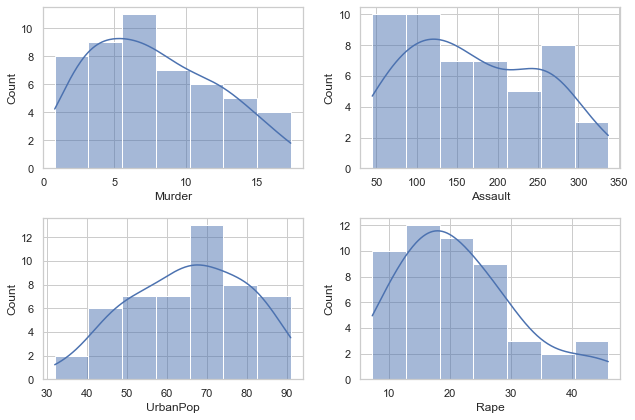
A. Import the data and visualize each column to get a general sense of the dataset.
Warning: Looks like you're using an outdated `kagglehub` version, please consider updating (latest version: 0.3.5)
State
Murder
Assault
UrbanPop
Rape
0
Alabama
13.2
236
58
21.2
1
Alaska
10.0
263
48
44.5
2
Arizona
8.1
294
80
31.0
3
Arkansas
8.8
190
50
19.5
4
California
9.0
276
91
40.6
import seaborn as snsimport matplotlib.pyplot as pltsns.set(style="whitegrid")_, axs = plt.subplots(2,2, figsize=(9,6))i =0for var in data.columns[1:]: sns.histplot(data=data, x=var, kde=True, ax=axs[i //2,i %2]) i +=1plt.tight_layout()plt.show()
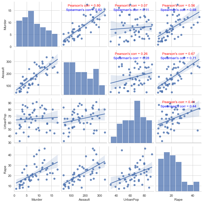
B. Study correlations between columns of the data using both Pearson and Spearman correlation coefficients.
pair_plot = sns.pairplot(data=data, kind='reg')# Function to calculate and display correlation coefficients import numpy as npfrom scipy.stats import spearmanrdef corr_func(x, y, **kws): r1 = np.corrcoef(x, y)[0, 1] r2, p_value = spearmanr(x, y) ax = plt.gca() ax.annotate(f"Pearson's corr = {r1:.2f}", xy=(0.5, 0.9), xycoords=ax.transAxes, ha='center', fontsize=12, color='red') ax.annotate(f"Spearman's corr = {r2:.2f}", xy=(0.5, 0.8), xycoords=ax.transAxes, ha='center', fontsize=12, color='blue') # Map the correlation coefficients onto the pairplotpair_plot.map_upper(corr_func)plt.show()
Given such a pairplot and based on correlations above, is it a good idea to perform dimensional reduction on this dataset? Why?
Pearson correlation matrix tells us that there are many linearly correlated columns within USArrests dataset. These highly linearly correlated columns carry almost similiar information therefore can likely be represented in smaller dimensional spaces. In summary, the more correlated columns in the data, the better it is to perform dimensional reduction on the data.
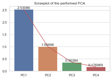
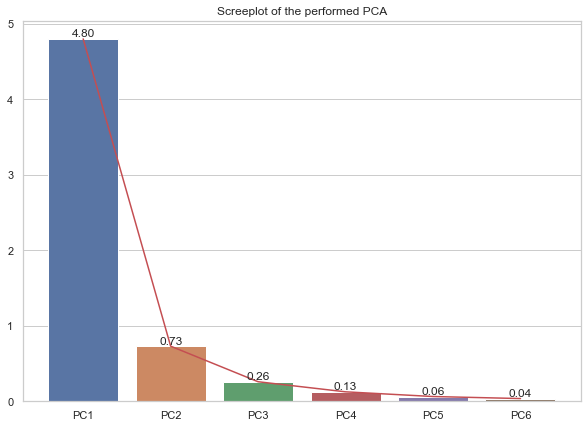
C. Perform reduced PCA (scaled and centered data) on this dataset.
Create the scree plot of explained variances of the data.
How many percentage of explained variance is retained by the first two principal components?
from sklearn.preprocessing import StandardScalerfrom sklearn.decomposition import PCAscaler = StandardScaler()X = scaler.fit_transform(data.iloc[:,1:])pca = PCA(n_components=4).fit(X)print(f'The first two PCs can capture around {np.sum(pca.explained_variance_ratio_[:2]*100).round(2)}% of the total variation of the data.')# Screeplotax = sns.barplot(x = ['PC'+str(i) for i inrange(1,5)], y=pca.explained_variance_)plt.plot(['PC'+str(i) for i inrange(1,5)], pca.explained_variance_, 'r')ax.bar_label(ax.containers[0])plt.title("Screeplot of the performed PCA")plt.show()
The first two PCs can capture around 86.75% of the total variation of the data.
print("Percentage of explained varaince:")pca.explained_variance_ratio_ *100
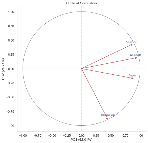
D. Create circle of correlation of the obtained PCA. Explain this correlation circle.
sns.set(style="whitegrid")pc_df = pd.DataFrame(pca.transform(X), columns=[f'PC{i+1}'for i inrange(X.shape[1])]) # Combine original data and principal components combined_data = pd.concat([pd.DataFrame(X, columns=data.columns[1:]), pc_df], axis=1)# Compute correlation matrix Corr_matrix = combined_data.corr()[['PC'+str(i) for i inrange(1,3)]].iloc[:4,:]# Circle of correlation plt.figure(figsize=(8, 8)) plt.axhline(0, color='grey', linestyle="--", lw=0.5) plt.axvline(0, color='grey', linestyle="--", lw=0.5) circle = plt.Circle((0, 0), 1, color='grey', fill=False) plt.gca().add_artist(circle) # Plot correlations for i inrange(4): plt.arrow(0, 0, Corr_matrix.iloc[i,0], Corr_matrix.iloc[i,1], color='r', alpha=0.9, head_width=0.03, head_length=0.03) plt.text(Corr_matrix.iloc[i,0], Corr_matrix.iloc[i,1] +0.05, data.columns[i+1], color='b', ha='center', va='center') plt.xlabel(f'PC1 ({(pca.explained_variance_ratio_[0]*100).round(2)}%)') plt.ylabel(f'PC2 ({(pca.explained_variance_ratio_[1]*100).round(2)}%)') plt.title('Circle of Correlation') plt.xlim(-1.1, 1.1) plt.ylim(-1.1, 1.1) plt.grid() plt.show()
Compute the contribution of original variables on the first two PCs (loadings).
When decomposing correlation matrix (reduced PCA) into \(C=U\Sigma U^T\) where
\(U\) is the unitary matrix (of eigenvectors of covariance matrix \(C\)) of size \(d\times d\), i.e., \(U^TU=I_d\).
\(\Sigma\) is a diagonal matrix of eigenvalues \(\lambda_1\geq\lambda_2\geq\dots\geq\lambda_d\geq 0\). It contains the variation along 1st, 2nd,…, \(d\) th direction of the data.
The contribution of original variable \(j\) on \(k\) PC or loadings are defined by
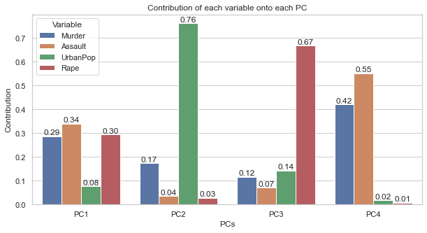
loadings = (pca.components_.T) **2* pca.explained_variance_contr = pd.DataFrame(loadings/pca.explained_variance_, index=data.columns[1:], columns=[f'PC{i+1}'for i inrange(pca.components_.shape[1])])print("Percentages of contributions of all variables on PCs:")contr.abs().round(4)*100
Percentages of contributions of all variables on PCs:
PC1
PC2
PC3
PC4
Murder
28.72
17.49
11.64
42.15
Assault
34.01
3.53
7.19
55.27
UrbanPop
7.74
76.18
14.29
1.79
Rape
29.53
2.80
66.88
0.79
plt.figure(figsize=(10,5))ax = sns.barplot(data=contr.reset_index().melt(id_vars='index', value_name="Contribution", var_name="PCs"), x="PCs", y="Contribution", hue="index")ax.set_title("Contribution of each variable onto each PC")for lab in ax.containers: ax.bar_label(lab, fmt="%.2f")plt.legend(title="Variable")plt.show()
PC1 has captured the main contribution from the three crime columns, while PC2 has been contributed the most by UrbanPop. We can give meaning to these PCs according to the variables that contributed the most to them.
PC1 can be seen as Crime Aaxis or Dangerous Level as it’s contributed the most by the crime variables.
PC2 may represent Urbanization axis.
Just by looking at this loadings, we might think that Murder and Assault contribute greatly to PC4 than PC1 therefore it is better to interpret them using PC4. However, this is not the right way to view these contributions. The percentage of contributions on PC1, though smaller than on PC4, but PC1 has captured much greater variation of the data than PC4 has. This means that smaller contributions on PC1 can be much more impactful and meaningful than the contributions on the insignificant direction such PC4. For example in our case, PC1 has captured more than \(60\%\) of the variation of the data while PC4 has captured only 4%. This means that the contribution of \(5\%\) on PC1 is more significant than \(70\%\) contribution on PC4.
We should also verify that the total contribution of each original variable on all PCs is \(100\%\)
import plotly.graph_objects as goimport plotly.express as pxfig = px.scatter(data_frame=scores, x="PC1", y="PC2", hover_name=scores.index, size=scores.PC1 **2+ scores.PC2 **2, color=scores.PC1 **2+ scores.PC2 **2)fig.update_layout( width=800, height=600, title="Individual scores on each PC", xaxis =dict(title=f"PC1 ({np.round(pca.explained_variance_ratio_[0]*100,2)}%)"), yaxis =dict(title=f"PC2 ({np.round(pca.explained_variance_ratio_[1]*100,2)}%)"))fig.show()
Unable to display output for mime type(s): application/vnd.plotly.v1+json
These are the contributions in percentages of individual observations onto each PC. Its total sum over all observations would give \(100\%\) variation along each direction. We should be able to verify this.
C:\Users\hasso\AppData\Local\Temp/ipykernel_16580/340204377.py:1: SettingWithCopyWarning:
A value is trying to be set on a copy of a slice from a DataFrame.
Try using .loc[row_indexer,col_indexer] = value instead
See the caveats in the documentation: https://pandas.pydata.org/pandas-docs/stable/user_guide/indexing.html#returning-a-view-versus-a-copy
from sklearn.preprocessing import StandardScalerscaler = StandardScaler()X_clean = scaler.fit_transform(X_clean)X_clean.shape
(392, 6)
B. Perform reduced PCA on this dataset.
How much information or variation is retained by the first two pCs?
from sklearn.decomposition import PCApca = PCA(n_components=6)pca = pca.fit(X_clean)print(f'Variation explained by the first two PCs: {np.sum(pca.explained_variance_ratio_[:2])}')
Variation explained by the first two PCs: 0.9194828785333572
# Screeplotplt.figure(figsize=(10,7))ax = sns.barplot(x = ['PC'+str(i) for i inrange(1,X_clean.shape[1]+1)], y=pca.explained_variance_)plt.plot(['PC'+str(i) for i inrange(1,X_clean.shape[1]+1)], pca.explained_variance_, 'r')ax.bar_label(ax.containers[0], fmt="%.2f")plt.title("Screeplot of the performed PCA")plt.show()
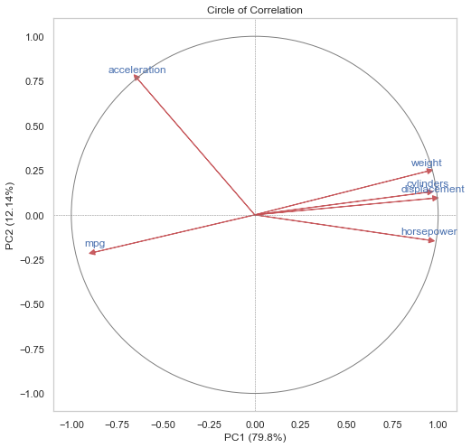
C. Create correlation circle and biplot. Comment.
plt.figure(figsize=(10,10))sns.set(style="whitegrid")pc_df = pd.DataFrame(pca.transform(X_clean), columns=[f'PC{i+1}'for i inrange(X_clean.shape[1])]) # Combine original data and principal components combined_data = pd.concat([pd.DataFrame(X_clean, columns=auto.columns[:-3]), pc_df], axis=1)# Compute correlation matrix Corr_matrix = combined_data.corr()[['PC'+str(i) for i inrange(1,3)]].iloc[:6,:]print(Corr_matrix)# Circle of correlation plt.figure(figsize=(8, 8)) plt.axhline(0, color='grey', linestyle="--", lw=0.5) plt.axvline(0, color='grey', linestyle="--", lw=0.5) circle = plt.Circle((0, 0), 1, color='grey', fill=False) plt.gca().add_artist(circle) # Plot correlations for i inrange(6): plt.arrow(0, 0, Corr_matrix.iloc[i,0], Corr_matrix.iloc[i,1], color='r', alpha=0.9, head_width=0.03, head_length=0.03) plt.text(Corr_matrix.iloc[i,0], Corr_matrix.iloc[i,1] +0.05, auto.columns[i], color='b', ha='center', va='center') plt.xlabel(f'PC1 ({(pca.explained_variance_ratio_[0]*100).round(2)}%)') plt.ylabel(f'PC2 ({(pca.explained_variance_ratio_[1]*100).round(2)}%)') plt.title('Circle of Correlation') plt.xlim(-1.1, 1.1) plt.ylim(-1.1, 1.1) plt.grid() plt.show()
import plotly.io as piopio.renderers.default ='notebook'import plotly.graph_objects as goimport plotly.express as pxpc_df.columns = ['PC'+str(i) for i inrange(1,7)]pc_df.index = car_namesfig1 = px.scatter( pc_df, x='PC1', y='PC2', size=X.dropna().cylinders, hover_name=car_names, size_max=15, color=X.mpg, symbol= X.dropna()['origin'].astype(object), title='Biplot of Auot-MPG dataset') cols = ['sandybrown', 'seagreen', 'red', 'sienna', 'skyblue', 'blue']# Add arrows for the loadings for i, feature inenumerate(pc_df.columns): fig1.add_trace(go.Scatter( x=[0, 2*Corr_matrix.iloc[i,0]], y=[0, 2*Corr_matrix.iloc[i,1]], mode='lines+text', name=Corr_matrix.index[i], line=dict(color=cols[i], width=2))) fig1.add_trace(go.Scatter( x=[2*Corr_matrix.iloc[i,0]], y=[2*Corr_matrix.iloc[i,1]], mode='markers', marker=dict(size=10, symbol='arrow-bar-up', angle=np.degrees(np.arctan2(2*Corr_matrix.iloc[i,0], 2*Corr_matrix.iloc[i,1])), color=cols[i]), showlegend=False))# Customize layout fig1.update_layout( coloraxis_colorbar_x=-0.275, width =700, height=500, xaxis_title=f'PC1 ({(pca.explained_variance_ratio_[0]*100).round(2)}%)', yaxis_title=f'PC2 ({(pca.explained_variance_ratio_[1]*100).round(2)}%)', showlegend=True )fig1.layout.coloraxis.colorbar.title ='MPG'fig1.show()
3. Mathematical Problem of PCA
From mathematical point of views, PCA can be seen as a process of searching for a subspace with maximum projection variance of the data points or searching for its closest low-rank approximation.
Suppose we have a design matrix of observations \(X\in\mathbb{R}^{n\times d}\) with centered columns. We aim to mathematically define 1st, 2nd,…, \(d\) th principal components of this matrix.
A. First PC: a vector \(\vec{u}_1\in\mathbb{R}^d\) is the \(1\) st PC direction of \(X\) if it is the direction (unit vector) in which the projection of observations \(X\) achieves maximum variance, i.e.,
Show that \(\vec{u}_1\) is the first eigenvector of matrix \(X^TX\) corresponding to its largest eigenvalue \(\lambda_1\).
Proof: This is a maximization of \(\|X\vec{u}\|=\vec{u}^TX^TX\vec{u}\) under the constraint that \(\|\vec{u}\|=1\). Lagranian of the probelm for parameter \(\lambda>0\) writes:
This implies that \(\vec{u}_1\) is the eigenvector of \(X^TX\) corresponding to eigenvalue \(\lambda>0\). As \(X^TX\) is symmetric, then by Spectral Theorem, \(X^TX\) is diagonalizable with the following decomposition:
\(U\) is a \(d\times d\)-dimensional unitary matrix (\(U^TU=UU^T=I_d\)) with columns \(\vec{u}_1,\dots,\vec{u}_d\) be the eigenvectors of \(X^TX\).
\(\Sigma=\text{diag}(\lambda_1,\dots,\lambda_d)\) be a diagonal matrix with diagonal elements \(\lambda_1\geq \dots\geq \lambda_d\geq 0\) be the eigenvalues corresponding to eigenvectors \(\vec{u}_1,\dots,\vec{u}_d\) respectively.
From this result, \((1)\) implies that the Lagrange multiplier \(\lambda=\lambda_1\) because \((1)\) is eigenvalue equation and \(\lambda_1\) is the maximum eigenvalue among all eigenvalues, and for the same reason \(\vec{u}_1\) must be the eigenvector corresponding to the eigenvalue \(\lambda_1\).
B. The \(k\) th PC: Let \(\widehat{X}_k=X-\sum_{j=1}^{k-1}X\vec{u}_j\vec{u}_j^T\), then the \(k\) th PC direction of \(X\) is the vector \(\vec{u}_k\in\mathbb{R}^d\) that is orthogonal to all the previous PCs \({\vec{u}_1,\dots,\vec{u}_{k-1}}\) satisfying
Show that \(\vec{u}_k\) is the \(k\) th eigenvector of matrix \(X^TX\) corresponding to its \(k\) th largest eigenvalue \(\lambda_k\leq\lambda_{k-1}\leq\dots\leq \lambda_1\).
Proof:
By induction, we suppose that it’s true up to dimension \(k\) such that \(1\leq k< d\). We shall check that the statement holds true until \(k+1\leq d\) if it’s true for all \(k<d\).
We write Lagrangian of the optimization problem for any \(\lambda_{p+1}>0\): \[\begin{align*}
{\cal L}(\vec{u}_{k+1},\lambda)&=\vec{u}_{k+1}^T\widehat{X}_{k+1}^T\widehat{X}_{k+1}\vec{u}_{k+1}-\lambda(\vec{u}_{k+1}^T\vec{u}_{k+1}-1)\\
&=\vec{u}_{k+1}^T\left(X-\sum_{j=1}^{k}X\vec{u}_j\vec{u}_j^T\right)\vec{u}_{k+1}-\lambda(\vec{u}_{k+1}^T\vec{u}_{k+1}-1)\\
&=\vec{u}_{k+1}^TX\left(I-\sum_{j=1}^{k}\vec{u}_j\vec{u}_j^T\right)\vec{u}_{k+1}-\lambda(\vec{u}_{k+1}^T\vec{u}_{k+1}-1)\\
&=\vec{u}_{k+1}^TX\left(\vec{u}_{k+1}-\sum_{j=1}^{k}\vec{u}_j\overbrace{\underbrace{\vec{u}_j^T\vec{u}_{k+1}}_{=\ 0}}^{\vec{u}_{k+1}\perp\vec{u}_j,\forall j\leq k}\right)-\lambda(\vec{u}_{k+1}^T\vec{u}_{k+1}-1)\\
&=\vec{u}_{k+1}^TX\vec{u}_{k+1}-\lambda(\vec{u}_{k+1}^T\vec{u}_{k+1}-1)\\
\end{align*}\]
By derivating the last equation with respect to all variable \(\vec{u}_{k+1}\) and \(\lambda>0\), we obtain the same eigenvalue equation as in the case of the 1st principal direction, which is \(X^TX\vec{u}_{k+1}=\lambda\vec{u}_{k+1}\). From Spectral Theorem the only vector that is orthogonal to all the previous eigenvalues \(\vec{u}_1,\dots,\vec{u}_k\) with the \((k+1)\)-th maximum variance is the \((k+1)\)-th eigenvector of \(X^TX\) which also means that \(\lambda=\lambda_{k+1}\) is the maximum variance along this direction. So, the problem has been proven by induction.
C. Show that the matrix \(\tilde{X}_k=\sum_{j=1}^k\lambda_j\vec{u}_j\vec{u}_j^T\) is the best low-rank approximation of the original data \(X\) w.r.t Frobenius norm, i.e.,