#%pip install gapminder           # This is for installing the package
from gapminder import gapminder
import pandas as pd
import numpy as npTP2 - Bivariate Analysis
Exploratory Data Analysis & Unsuperivsed Learning
Course: PHAUK Sokkey, PhD
TP: HAS Sothea, PhD
Objective: To equip you all with the skills to analyze and interpret the relationship between two variables. You will explore these relationships as a function of time using the Gapminder dataset.
The
Jupyter Notebookfor this TP can be downloaded here: TP2-Bivariate-Gapminder.
1. Correlation matrix
a. Compute correlation matrix of the three quantitative variables on year \(1952\) then \(1987\) and then \(2007\) using pd.corr(). Give a brief description of each correlation matrix.
cor1952 = gapminder.loc[gapminder.year == 1952,["lifeExp", "gdpPercap", "pop"]].corr()
cor1987 = gapminder.loc[gapminder.year == 1987,["lifeExp", "gdpPercap", "pop"]].corr()
cor2007 = gapminder.loc[gapminder.year == 2007,["lifeExp", "gdpPercap", "pop"]].corr()cor1952| lifeExp | gdpPercap | pop | |
|---|---|---|---|
| lifeExp | 1.000000 | 0.278024 | -0.002725 |
| gdpPercap | 0.278024 | 1.000000 | -0.025260 |
| pop | -0.002725 | -0.025260 | 1.000000 |
cor1987| lifeExp | gdpPercap | pop | |
|---|---|---|---|
| lifeExp | 1.000000 | 0.749905 | 0.033062 |
| gdpPercap | 0.749905 | 1.000000 | -0.051705 |
| pop | 0.033062 | -0.051705 | 1.000000 |
cor2007| lifeExp | gdpPercap | pop | |
|---|---|---|---|
| lifeExp | 1.000000 | 0.678662 | 0.047553 |
| gdpPercap | 0.678662 | 1.000000 | -0.055676 |
| pop | 0.047553 | -0.055676 | 1.000000 |
Description:
- In 1952, very weak correlations were observed among the three variables. There appears to be no relationship between
popandlifeExp, while a weak correlation (\(0.28\)) exists betweenlifeExpandgdpPercap, suggesting a weak connection between a country’s economy and its people’s health. - In 1987, a clear relationship between economy and people’s health is present while population remains independent from others.
- In 2007, the same thing is observed with slightly weaker connection between economy and health.
b. From the previuos results, plot each correlation matrix using color map which is very helpful for large correlation matrices (can you use corr.style.background_gradient()).
cor1952.style.background_gradient(cmap="coolwarm")| lifeExp | gdpPercap | pop | |
|---|---|---|---|
| lifeExp | 1.000000 | 0.278024 | -0.002725 |
| gdpPercap | 0.278024 | 1.000000 | -0.025260 |
| pop | -0.002725 | -0.025260 | 1.000000 |
cor1987.style.background_gradient(cmap="coolwarm")| lifeExp | gdpPercap | pop | |
|---|---|---|---|
| lifeExp | 1.000000 | 0.749905 | 0.033062 |
| gdpPercap | 0.749905 | 1.000000 | -0.051705 |
| pop | 0.033062 | -0.051705 | 1.000000 |
cor2007.style.background_gradient(cmap="coolwarm")| lifeExp | gdpPercap | pop | |
|---|---|---|---|
| lifeExp | 1.000000 | 0.678662 | 0.047553 |
| gdpPercap | 0.678662 | 1.000000 | -0.055676 |
| pop | 0.047553 | -0.055676 | 1.000000 |
c. From the previous result, pick the most interesting pair of variables and plot a graphic illustrating their relationship for each year using proper axis scaling and title. Do you see one interesting country in 1952? Guess which country is it? Investigate why is this the case?
import warnings
warnings.filterwarnings('ignore')

import matplotlib.pyplot as plt
import seaborn as sns
_, ax = plt.subplots(1, 3, figsize=(13, 4))
years = [1952, 1987, 2007]
for i in range(3):
    df = gapminder.loc[gapminder.year == years[i],:]
    df["Point"] = "Other"
    df.loc[df.country == "Kuwait", "Point"] = "Kuwait"
    sns.scatterplot(data=df,
                    x = "gdpPercap",
                    y = "lifeExp",
                    ax=ax[i],
                    hue="Point")
    ax[i].set_xscale("log")
    ax[i].set_title(f"Health vs Economy in {years[i]}")
plt.tight_layout()
Before the discovery of oil reserves in 1938, Kuwait was a regional trade port. From 1946 to 1982, the country underwent large-scale modernization, largely based on oil production income. The 1980s brought geopolitical instability and an economic crisis following a stock market crash. In 1990, Kuwait was invaded and annexed by Iraq under Saddam Hussein’s leadership, following disputes over oil production. The Iraqi occupation of Kuwait ended on 26 February 1991, after an international coalition led by the U.S., U.K., France, Saudi Arabia, and Egypt expelled the Iraqi forces.
d. Revisit your explanation of correlation matrix for year 1952 in question a., can you see why did you observe such a (poor) correlation in 1952?
Remark: Correlation matrix can summarize linear relationship between pairs of quantitative variables but it might be inacurate and influenced by outliers, non-linearity, small sample size, confounding variables…
2. Visualization with more information
Scatterplot is the primary graphic type for visualizing the relationship between two quantitative variables. Additionally, you can include other factors of interest using color, shape, size, facets, etc., depending on the type of those variables.
The following questions apply to the years 1952, 1987, and 2007:
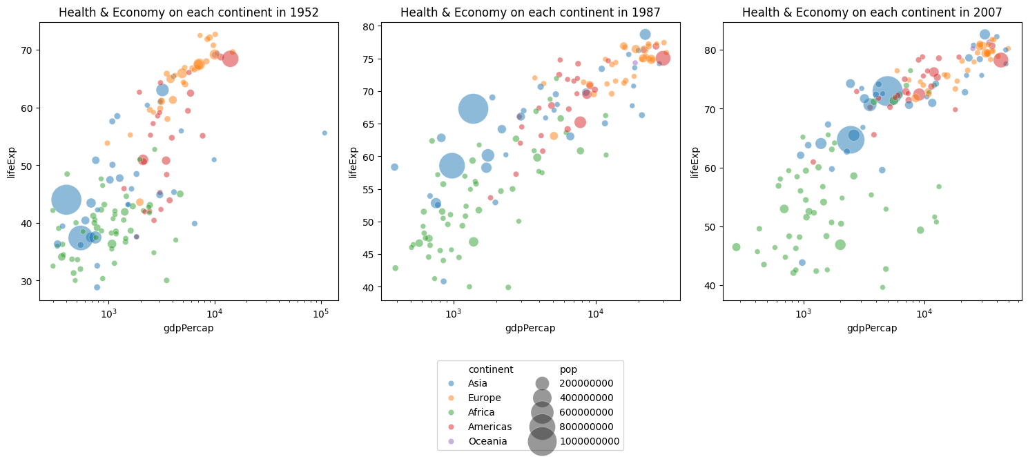
a. Do you think health conditions and economies differ across continents? Visualize it in a graphic.
data_dict = {1952: gapminder.loc[gapminder.year == 1952,:],
             1987: gapminder.loc[gapminder.year == 1987,:],
             2007: gapminder.loc[gapminder.year == 2007,:]}

_, ax = plt.subplots(1, 3, figsize=(13, 4))
for i in range(3):
    df = data_dict[years[i]]
    sns.scatterplot(data=df,
                    x = "gdpPercap",
                    y = "lifeExp",
                    ax=ax[i],
                    hue="continent",
                    alpha=0.5)
    ax[i].set_xscale("log")
    ax[i].set_title(f"Health & Economy on each continent in {years[i]}", fontsize=12)
    ax[i].legend(fontsize=10)
plt.tight_layout()
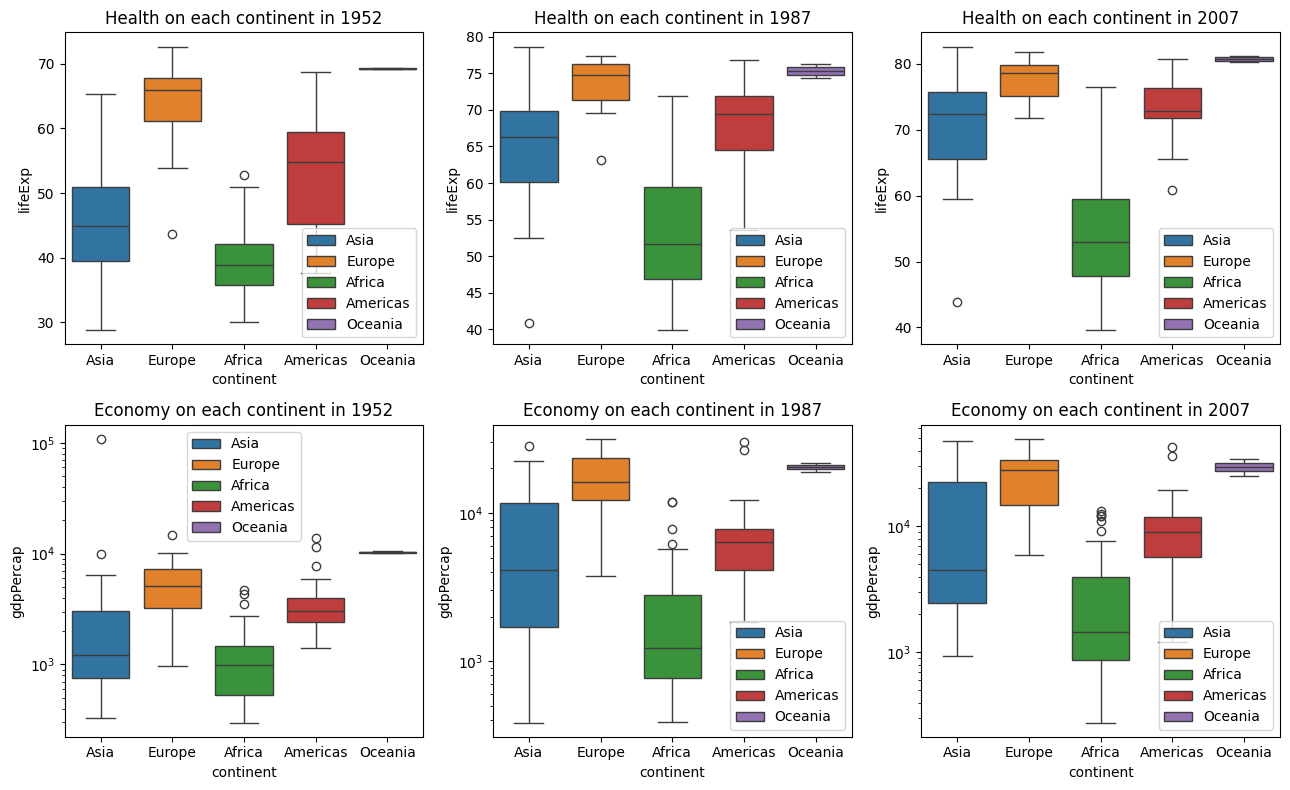
b. Confirm the previous claim using conditional distribution graphs. Hint: plot distribution of continuous variables on each continent.
_, ax = plt.subplots(2, 3, figsize=(13, 8))
for i in range(3):
    df = data_dict[years[i]]
    sns.boxplot(data=df,
                x = "continent",
                y = "lifeExp",
                ax=ax[0,i],
                hue="continent",
                legend=True)
    ax[0,i].set_title(f"Health on each continent in {years[i]}", fontsize=12)
    ax[0,i].legend(fontsize=10)
    sns.boxplot(data=df,
                x = "continent",
                y = "gdpPercap",
                ax=ax[1,i],
                hue="continent",
                legend=True)
    ax[1,i].set_title(f"Economy on each continent in {years[i]}", fontsize=12)
    ax[1,i].legend(fontsize=10)
    ax[1,i].set_yscale("log")
plt.tight_layout()
In both cases, average values of the continuous variables within different continents are significantly different (this will be studied in detail later) indicating the influence of variable continent (categorical) on both continuous variables. Such a categorical variable is considered useful for building models (if applicable) to predict these continuous variables.
c. We will try to confirm this using Analysis of Variance (ANOVA). In 2007, - Perform one way ANOVA on lifeExp and continent (you can use f_oneway from scipy.stats module). - Do the same with gdpPercap and continent. - Are these results reliable? Why? - Propose ideas that might solve this problem or an alternative method.
from scipy.stats import f_oneway
f_oneway(*[data_dict[2007]['lifeExp'][data_dict[2007]['continent'] == x] for x in np.unique(data_dict[2007]['continent'])])
F_onewayResult(statistic=59.71400373020901, pvalue=4.217495990972665e-29)- Do the same with
gdpPercapandcontinent.
f_oneway(*[data_dict[2007]['gdpPercap'][data_dict[2007]['continent'] == x] for x in np.unique(data_dict[2007]['continent'])])F_onewayResult(statistic=25.24196328631369, pvalue=1.1269446511148907e-15)- Are these results reliable? Why?
In both cases, with such low p-values, we can reject hypothesis of equal mean among different continents. However, this is not reliable as the normality and homoscedasticity are likely not satisfied. We try
boxcoxtransformation as follow.
from scipy.stats import boxcox
[boxcox(data_dict[2007]['lifeExp'][data_dict[2007]['continent'] == x], 0.3).std() for x in np.unique(data_dict[2007]['continent'])]
[0.5652874254064025,
0.2191728602929905,
0.42274559559468855,
0.14015502992462908,
0.023842251154744254]The transformation doesn’t seem to help. We will try
Kruskal–Wallisnon-parametric test that doesn’t realize on these assumptions.
from scipy.stats import kruskal
kruskal(*[np.log(data_dict[2007]['lifeExp'][data_dict[2007]['continent'] == x]) for x in np.unique(data_dict[2007]['continent'])])
KruskalResult(statistic=88.094799208474, pvalue=3.3429288689701896e-18)kruskal(*[np.log(data_dict[2007]['gdpPercap'][data_dict[2007]['continent'] == x]) for x in np.unique(data_dict[2007]['continent'])])KruskalResult(statistic=71.0881819903725, pvalue=1.337256076944171e-14)We still come to the same conclusion that we are almost certain that we can reject the null hypothesis that the average
lifeExpor averagegdpPercapamong these are all equal.
d. We have previously described the relationship between population and life expectancy or GDP per capita. Now, show this by defining size of points according to variable pop.
_, ax = plt.subplots(1, 3, figsize=(15, 7))
for i in range(3):
    df = data_dict[years[i]]
    if i == 1:
        show_legend = True
    else:
        show_legend = False
    sns.scatterplot(data=df,
                    x = "gdpPercap",
                    y = "lifeExp",
                    ax=ax[i],
                    hue="continent",
                    size="pop",
                    sizes=(30, 1000),
                    legend=show_legend,
                    alpha=0.5)
    ax[i].set_xscale("log")
    ax[i].set_title(f"Health & Economy on each continent in {years[i]}", fontsize=12)
ax[1].legend(loc='upper center', bbox_to_anchor=(0.5, -0.2), ncol=2)
plt.tight_layout()
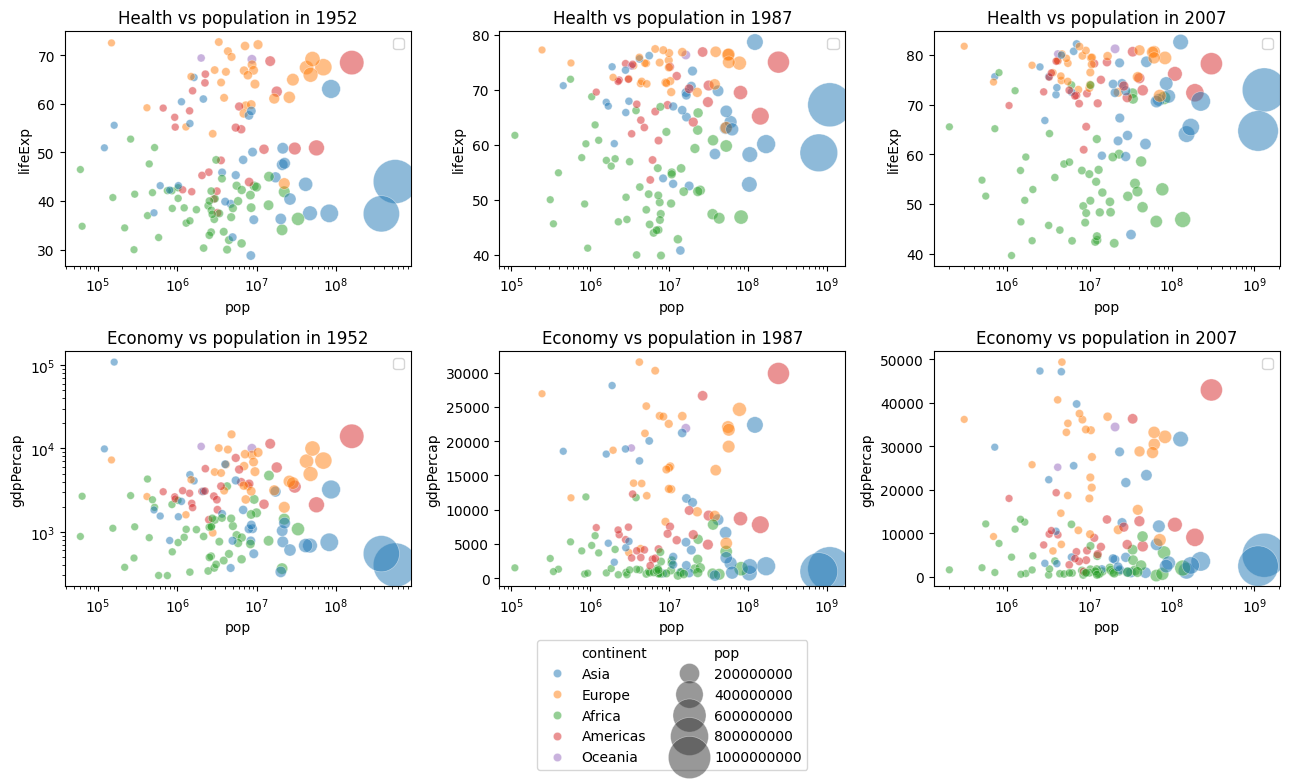
e. Now, directly visualize the relation between population and life expactancy, then the relation between population and GPD per Capita. Explain the resulting graphs.
_, ax = plt.subplots(2, 3, figsize=(13, 8))
for i in range(3):
    df = data_dict[years[i]]
    sns.scatterplot(data=df,
                x = "pop",
                y = "lifeExp",
                ax=ax[0,i],
                hue="continent",
                size="pop",
                alpha=0.5,
                sizes=(30, 1000),
                legend=False)
    ax[0,i].set_title(f"Health vs population in {years[i]}", fontsize=12)
    ax[0,i].legend(fontsize=10)
    ax[0,i].set_xscale("log")
    if i == 1:
        show_legend = True
    else:
        show_legend = False
    sns.scatterplot(data=df,
                x = "pop",
                y = "gdpPercap",
                ax=ax[1,i],
                size="pop",
                sizes=(30, 1000),
                hue="continent",
                alpha=0.5,
                legend=show_legend)
    ax[1,i].set_title(f"Economy vs population in {years[i]}", fontsize=12)
    ax[1,i].legend(fontsize=10)
    if i == 0:
        ax[1,i].set_yscale("log")
    ax[1,i].set_xscale("log")
ax[1,1].legend(loc='upper center', bbox_to_anchor=(0.5, -0.2), ncol=2)
plt.tight_layout()
3. Time evolution
We have looked at the world on three frames so far (1952, 1987 and 2007). Now, we will summarize the world from 1952 to 2007 in one graph using animation tool from plotly.express.
Seabornwas built onMatplotlib, making it simpler for statistical plots and integrating well withPandas. It is great for quick, aesthetic and informative statistical plots.Plotlyon the other hand built as highly interactive plots with features like zooming, panning, and hover information. It works well in web applications and dashboards. There are extensive customization options for aesthetics, and it supports 3D visualizations, complex plots and animations. Read more here: https://plotly.com/python/.
a. Using plotly, create one scatterplot that summarizes the world using all information: gdpPercap, lifeExp, pop, continent and set option animation_frame=“year” which will create frame by frame animated scatterplot of the world from 1952 to 2007.
b. b. Describe what you observed: the world from 1952 to 2007.
import plotly.io as pio
pio.renderers.default = 'notebook'
import plotly.express as px
px.scatter(gapminder, x="gdpPercap", y="lifeExp", animation_frame="year", animation_group="country",
           size="pop", color="continent", hover_name="country",
           log_x=True, size_max=55, range_x=[200, 100000], range_y=[25, 90],
           width=800, height=600,
           title="The world evolution from 1952 to 2007")
Further readings
- Gapminder documentation: https://www.gapminder.org/data/documentation/
- A short demonstration video is available here: Hans Rosling’s 200 Countries, 200 Years, 4 Minutes - The Joy of Stats - BBC Four.
- Graphical tools: