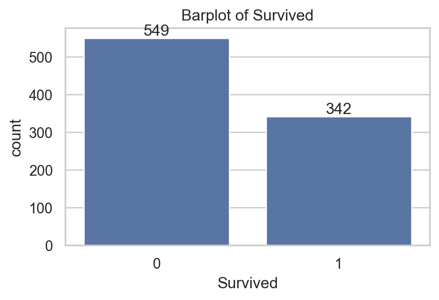
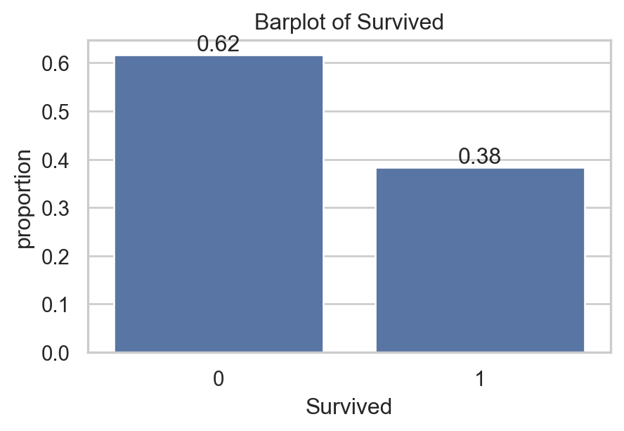
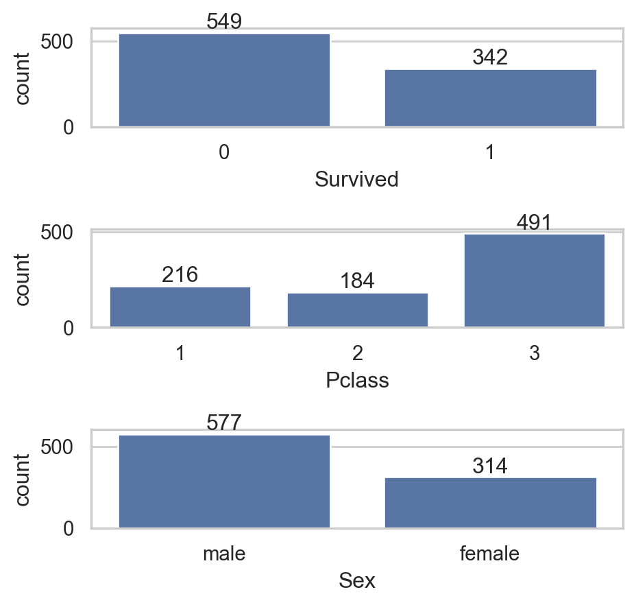
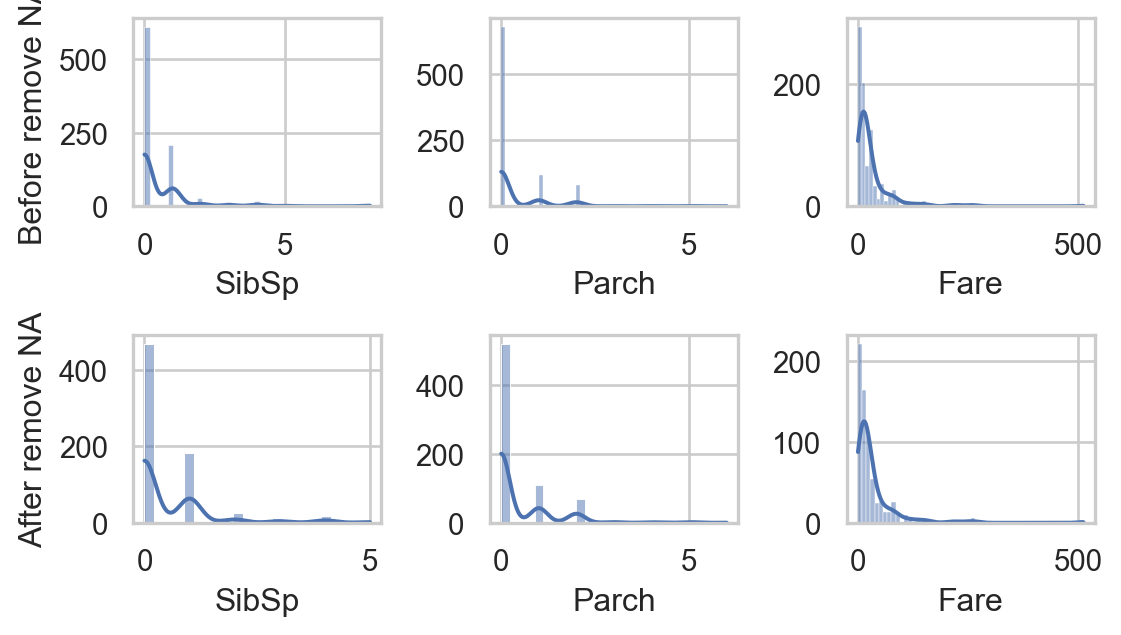
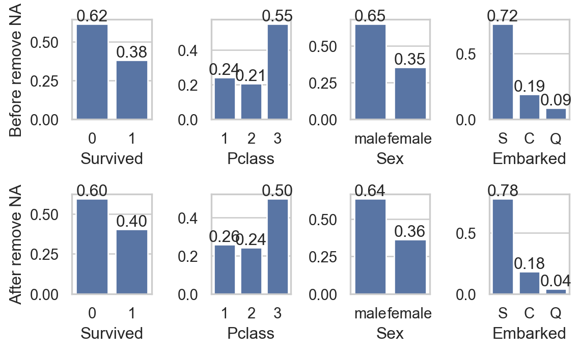
import seaborn as sns
import matplotlib.pyplot as plt
sns.set(style="whitegrid")
fig, axs = plt.subplots(2, 4, figsize=(6, 3.75))
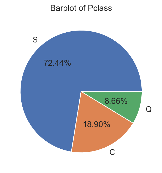
col_qual = ['Survived', 'Pclass', 'Sex', 'Embarked']
for i, va in enumerate(col_qual):
sns.countplot(data, x=va, ax=axs[0,i], stat = "proportion")
axs[0,i].bar_label(axs[0,i].containers[0], fmt="%0.2f")
sns.countplot(data.dropna(), x=va, ax=axs[1,i] , stat = "proportion")
axs[1,i].bar_label(axs[1,i].containers[0], fmt="%0.2f")
if i == 0:
axs[0,i].set_ylabel("Before remove NA")
axs[1,i].set_ylabel("After remove NA")
else:
axs[0,i].set_ylabel("")
axs[1,i].set_ylabel("")
plt.tight_layout()
plt.show()