Code
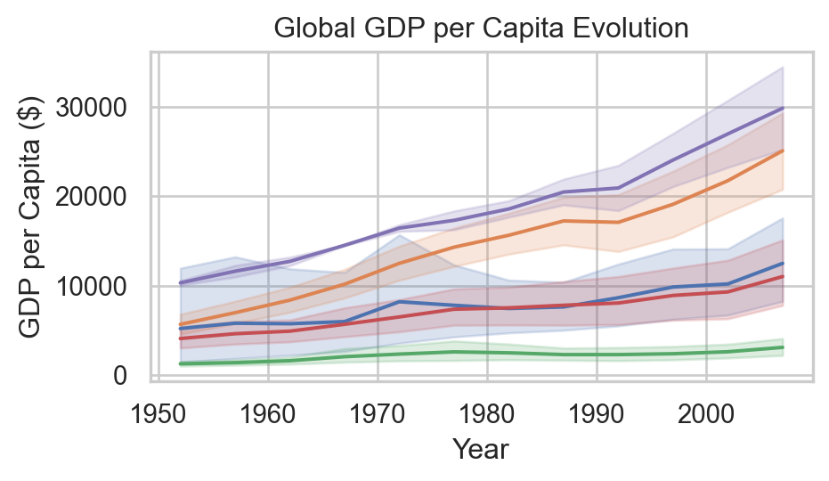
| country | continent | lifeExp | pop | gdpPercap |
|---|---|---|---|---|
| Afghanistan | Asia | 43.828000 | 31889923 | 974.580338 |
| Albania | Europe | 76.423000 | 3600523 | 5937.029526 |
| Algeria | Africa | 72.301000 | 33333216 | 6223.367465 |
| Angola | Africa | 42.731000 | 12420476 | 4797.231267 |
ITM-370: Data Analytics
![]()
Note
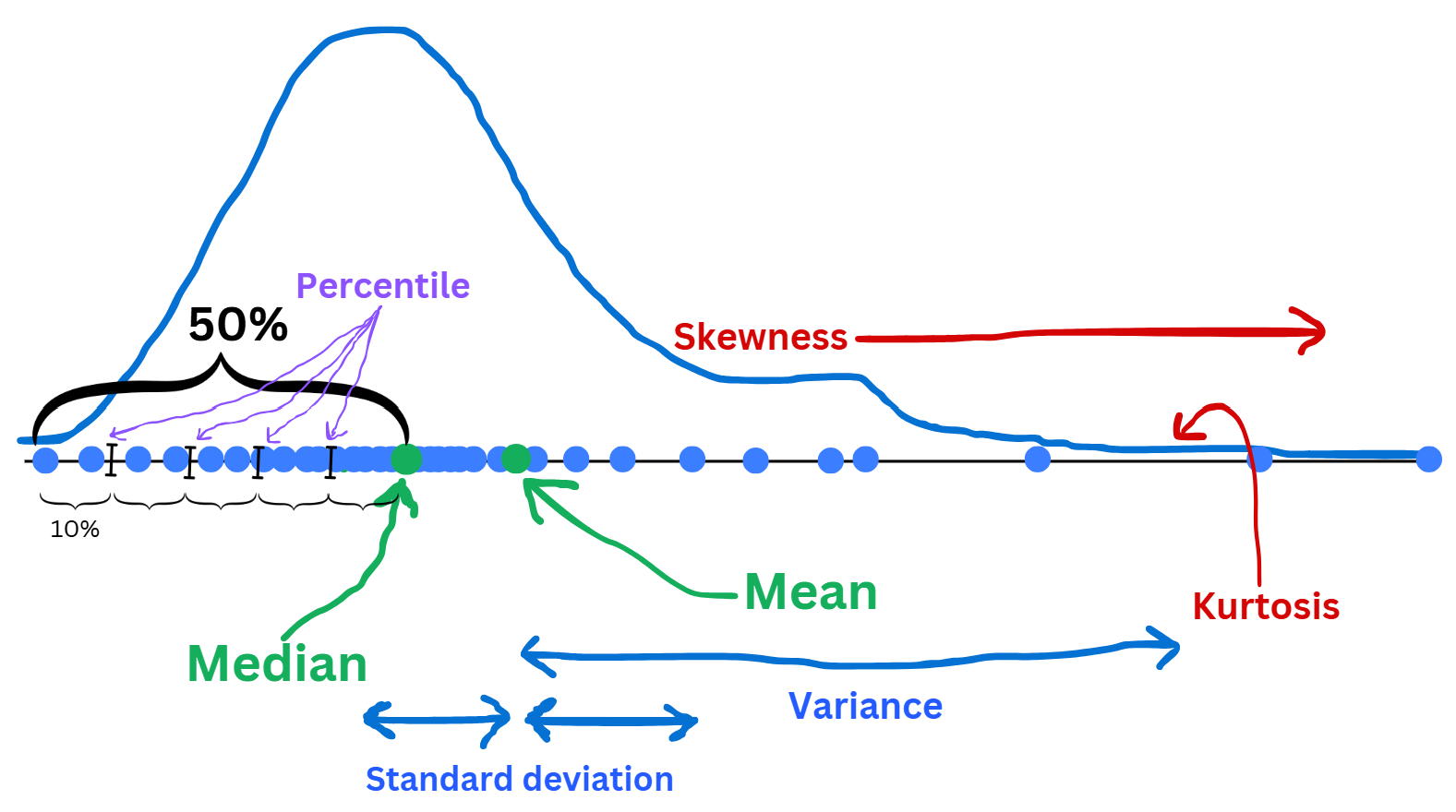
🤔 Anything interesting from these 3 correlation matrices?

We grouped gdpPercap into 3 classes:
Are the categories of the 1st qualitative data different on each category of the 2nd qualitative variable?
Mosaic plot represents this effect.
Different = Influenced = Related.
from statsmodels.graphics.mosaicplot import mosaic
import pandas as pd
fig, ax = plt.subplots(figsize=(9, 5))
def prop(key):
    if "Asia" in key:
        return {'color': '#51cb4b'}
    if "Europe" in key:
        return {'color': '#dda63e'}
    if "Africa" in key:
        return {'color': '#e35441'}
    if "Americas" in key:
        return {'color': '#41b4e3'}
    if "Oceania" in key:
        return {'color': '#b374df'}

data2007['gdp_category'] = pd.qcut(data2007['gdpPercap'], q=3, labels=['Developing', 'Emerging', 'Developed'])
mosaic(data2007, ['continent','gdp_category'], gap=0.01, properties = prop, label_rotation=30, ax=ax)
plt.show()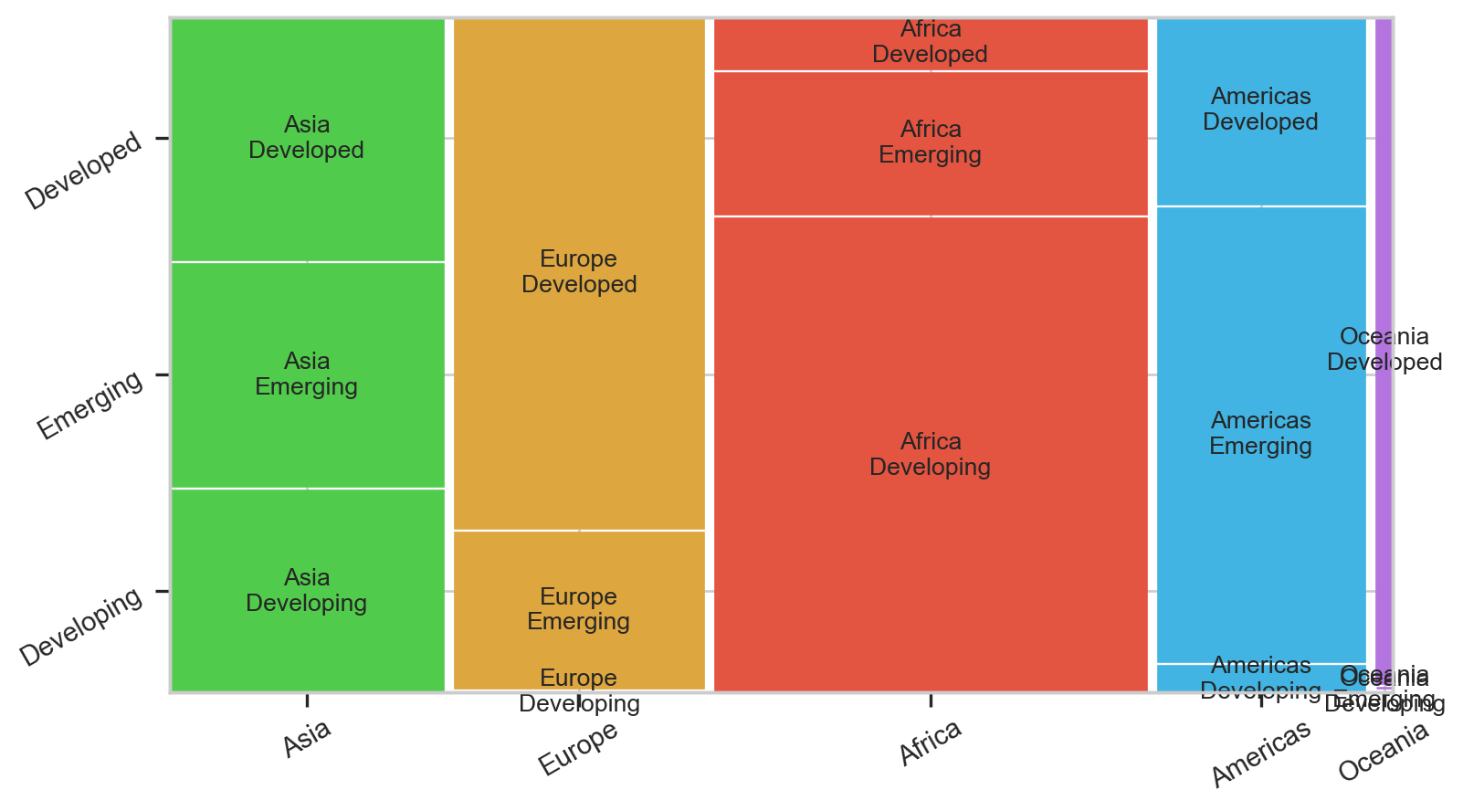
![]()