Objective: This practical lab aims to enhance your skills in implementing simple and multiple linear regression using market data covered in the course.
You need internet to load the data by running the following codes. We will simply call it data.
import pyreadrimport pandas as pddata = pd.read_csv("https://raw.githubusercontent.com/hassothea/Data_Analytics_AUPP/refs/heads/main/data/marketing.csv", sep=",")data.head(5)
youtube
facebook
newspaper
sales
0
276.12
45.36
83.04
26.52
1
53.40
47.16
54.12
12.48
2
20.64
55.08
83.16
11.16
3
181.80
49.56
70.20
22.20
4
216.96
12.96
70.08
15.48
1. Study correlation matrix
A. Compute correlation matrix of this data using pd.corr() function. Explain this correlation matrix (see slide 21).
data.corr()
youtube
facebook
newspaper
sales
youtube
1.000000
0.054809
0.056648
0.782224
facebook
0.054809
1.000000
0.354104
0.576223
newspaper
0.056648
0.354104
1.000000
0.228299
sales
0.782224
0.576223
0.228299
1.000000
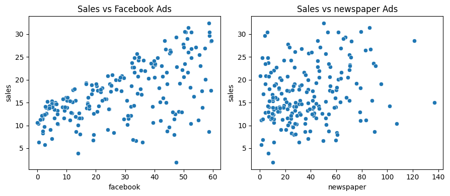
B. Plot scatterplot of the following pairs: - Facebook (x-axis) vs Sales (y-axis) - Newspaper (x-axis) vs Sales (y-axis)
You should add title and using proper name for each axis.
import matplotlib.pyplot as pltimport seaborn as snsimport plotly.express as px_, ax = plt.subplots(1,2, figsize=(9, 4))sns.scatterplot(data, x="facebook", y="sales", ax=ax[0])ax[0].set_title("Sales vs Facebook Ads")sns.scatterplot(data, x="newspaper", y="sales", ax=ax[1])ax[1].set_title("Sales vs newspaper Ads")plt.tight_layout()
Key remark: Correlation matrix tells us a lot about which inputs are useful for constructing the model. If we were to build a model using only one input, use the one having the highest correlation with the target. On the other hand, putting many highly correlated inputs together can result in a bad model because it can lead to multicollinearity. This means the model has difficulty distinguishing the individual effects of each input variable, resulting in unstable and unreliable coefficient estimates. Additionally, it can inflate the variance of the regression coefficients, making the model less interpretable and potentially overfitting the data. Simply put, it muddies the waters.
2. Simple Linear Regression
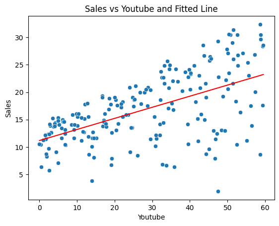
A. We already used YouTube as an explanatory variable to predict Sales in the course.
Now, build a SLR model to predict sales using Facebook.
from sklearn.linear_model import LinearRegression# Prepare data X and yX1, y = data[['facebook']], data['sales']# Build modellr1 = LinearRegression()# Fit the model on the datalr1 = lr1.fit(X1, y)# Plot fitted liney_hat1 = lr1.predict(X1)sns.scatterplot(x=X1.to_numpy().reshape(-1), y=y)sns.lineplot(x=X1.to_numpy().reshape(-1), y=y_hat1, color="red")plt.xlabel("Youtube")plt.ylabel("Sales")plt.title("Sales vs Youtube and Fitted Line")plt.show()
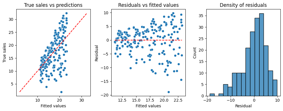
Perform model dignosis:
Compute \(R^2\) then explain the observed value.
Compute and plot residuals for this model. Conclude.
from sklearn.metrics import r2_score# Compute R-squaredprint(f"R-squared: {r2_score(y,y_hat1)}")# Graphresid1 = y - y_hat1data_resid1 = pd.DataFrame({'True sales': y,'Residual' : resid1,'Fitted values': y_hat1})import numpy as np_, ax = plt.subplots(1,3, figsize=(10, 4))sns.scatterplot(data_resid1, x="Fitted values", y="True sales", ax=ax[0])sns.lineplot(x=[np.min(y), np.max(y)], y=[np.min(y), np.max(y)], ax=ax[0], color="red", linestyle="--")ax[0].set_title("True sales vs predictions")sns.scatterplot(data_resid1, x="Fitted values", y="Residual", ax=ax[1])sns.lineplot(x=[np.min(y_hat1), np.max(y_hat1)], y=[0, 0], ax=ax[1], color="red", linestyle="--")ax[1].set_title("Residuals vs fitted values")sns.histplot(data_resid1, x="Residual", ax=ax[2])ax[2].set_title("Density of residuals")plt.tight_layout()plt.show()
R-squared: 0.33203245544529536
The first graph is the qqplot (true vs predict) of the model. The closer the points to the line represents the better fit the model. Here, the points are biased indicating the poor quality of the model.
Second plot indicates that the residuals are not so symmetric around 0 and the variation are not consistent. They have larger spreads around large fitted values which indicating the poor predictive power of the model around large values of sales.
The residual density is skewed to left inidcating that the model tends to overestimate the true sales (because residual \(e < 0\Leftrightarrow y-\hat{y}<0\Leftrightarrow y < \hat{y}\)).
B. Repeat question (A) but using newspaper as an input for SLR instead.
# Try to do it using the previous example
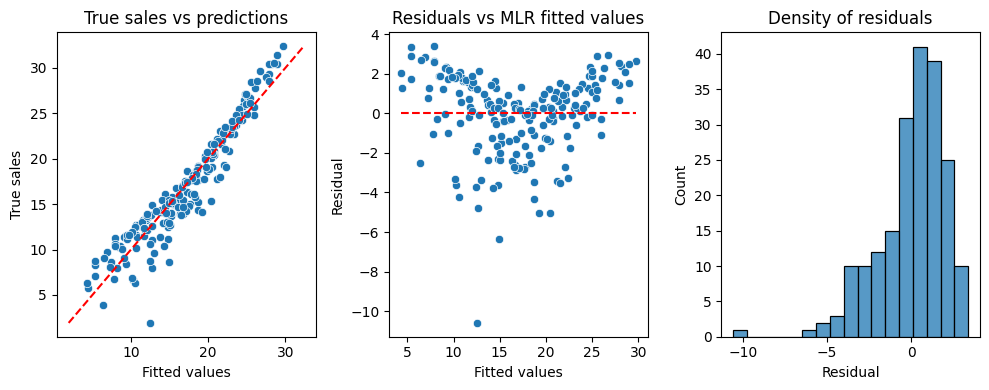
3. Multiple Linear Regression
We already build a MLR with two inputs during the course. Now, you will do it using all three inputs.
QQplot on the left indicates much better predictions of the model as the points are much closer to the line compared to the previous case.
The residuals are not symmetric. The shape suggests that the model under estimates the true sales around low and high values but over estimates the middle range values of sales.
The density of the residuals is still skewed a little to the left as indicating the higher predictions than reality. However, this is much more better compared to the previous case in general.