Code
| country | lifeExp | pop | gdpPercap | |
|---|---|---|---|---|
| 10 | Afghanistan | 42.129 | 25268405 | 726.734055 |
| 22 | Albania | 75.651 | 3508512 | 4604.211737 |
| 34 | Algeria | 70.994 | 31287142 | 5288.040382 |
INF-604: Data Analysis
![]()
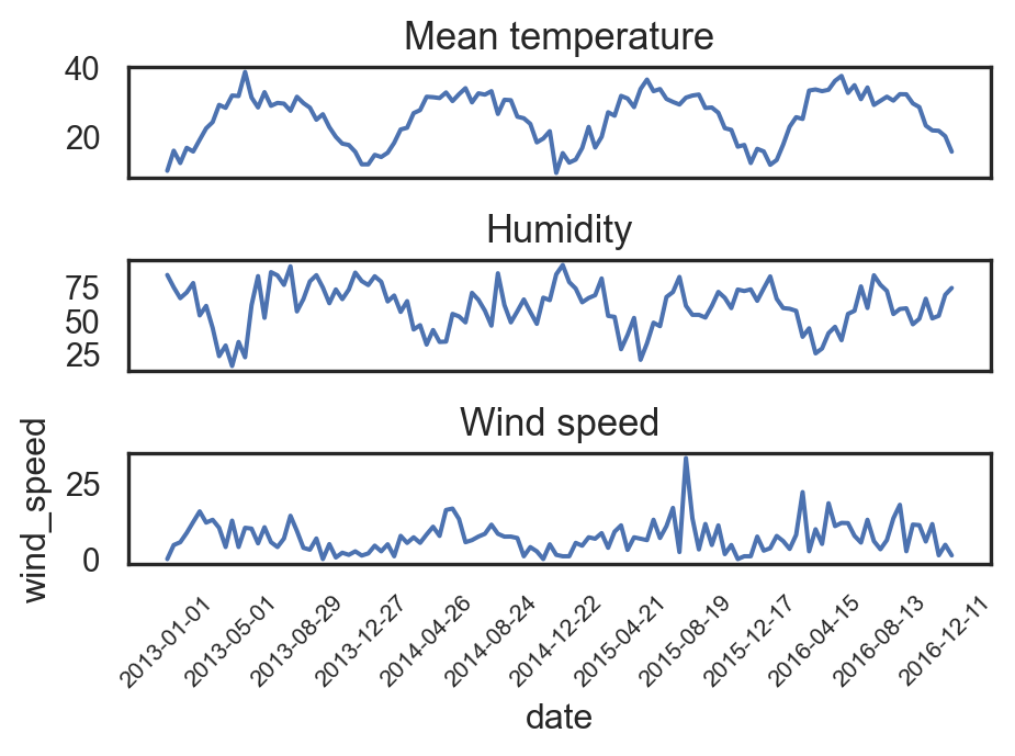
import matplotlib.pyplot as plt
sns.set(style="white")
_, axs = plt.subplots(3, 1, figsize=(5,4.5))
sns.lineplot(df_climate.iloc[::12,:], x="date", y="meantemp", ax=axs[0])
axs[0].set_title("Mean temperature", fontsize=13)
axs[0].set_xticks([])
axs[0].set_ylabel("")
axs[0].set_xlabel("")

sns.lineplot(df_climate.iloc[::12,:], x="date", y="humidity", ax=axs[1])
axs[1].set_title("Humidity", fontsize=13)
axs[1].set_xticks([])
axs[1].set_ylabel("")
axs[1].set_xlabel("")

sns.lineplot(df_climate.iloc[::12,:], x="date", y="wind_speed", ax=axs[2])
axs[2].set_title("Wind speed", fontsize=13)
# axs[2].tick_params(axis='x', labelrotation=90, size=8)
plt.xticks(df_climate.iloc[::12,:].date[::10], rotation=45, size=8)
plt.tight_layout()
plt.show()
import plotly.express as px
def cat_gdp(yearly_data):
return pd.qcut(yearly_data, q=3, labels=['Developing', 'Emerging', 'Developed'])
df = gapminder
# Apply the function to each year
df['GDP_Category'] = df.groupby('year').apply(lambda x: cat_gdp(x.gdpPercap)).reset_index(level=0, drop=True)
df_Af = df.query("continent == 'Asia'")
# Aggregate the data
df_agg = df_Af.groupby(['year', 'GDP_Category']).size().reset_index(name='Count')
# Create the stacked bar chart
fig = px.bar(
df_agg, x='year', y='Count',
color='GDP_Category', barmode='stack',
title="Evolution of Asian Countries' GDP from 1952 to 2007",
labels={'Count': 'Number of Countries', 'year': 'Year'})
fig.update_layout(height=410, width=500)
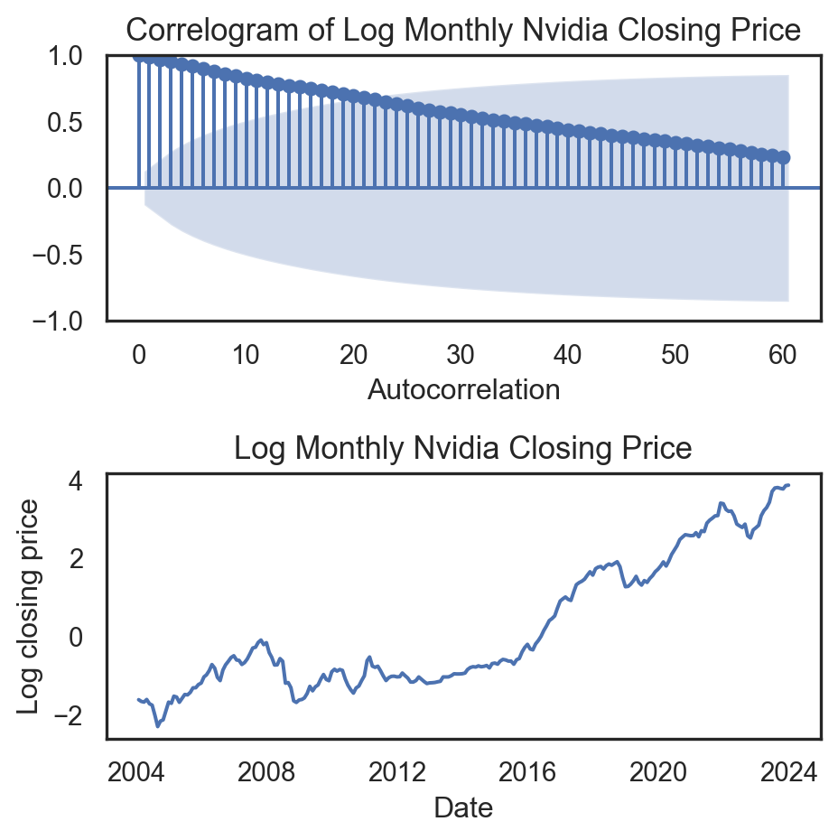
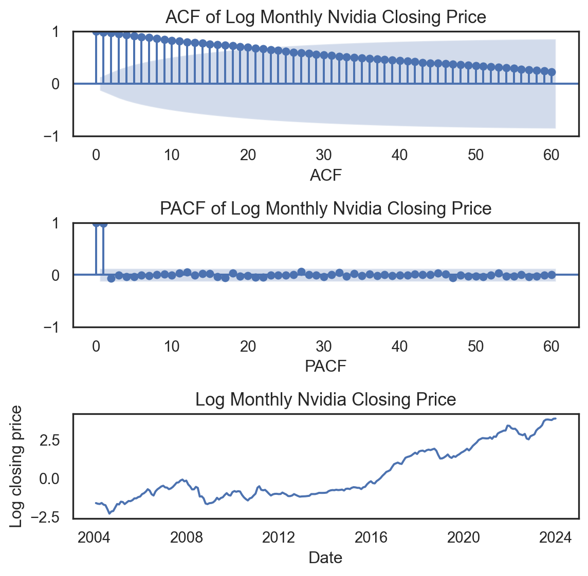
fig.show()from statsmodels.graphics.tsaplots import plot_acf
_, ax = plt.subplots(2,1,figsize=(6, 4))
plot_acf(df_lag.Temp, lags=60, ax=ax[0])
ax[0].set_title('Correlogram for Mean Temperature', fontsize=13)
ax[0].set_xlabel('Lag')
ax[0].set_ylabel('Autocorrelation')
sns.lineplot(df_climate.iloc[::12,:].iloc[:60,:], x="date", y="meantemp", ax=ax[1])
ax[1].set_title("Mean temperature", fontsize=13)
ax[1].set_ylabel("")
ax[1].set_xlabel("")
plt.xticks(df_climate.iloc[::12,:].iloc[:60,:].date[::10], rotation=45, size=8)
plt.tight_layout()
plt.show()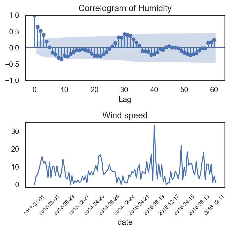
from statsmodels.graphics.tsaplots import plot_pacf
_, ax = plt.subplots(2,1,figsize=(6, 4))
plot_pacf(df_lag.Temp, lags=50, ax=ax[0])
ax[0].set_title('Correlogram for Mean Temperature', fontsize=13)
ax[0].set_xlabel('Lag')
ax[0].set_ylabel('Partial Autocorrelation')

sns.lineplot(df_climate.iloc[::12,:].iloc[:60,:], x="date", y="meantemp", ax=ax[1])
ax[1].set_title("Mean temperature", fontsize=13)
ax[1].set_ylabel("")
ax[1].set_xlabel("")
plt.xticks(df_climate.iloc[::12,:].iloc[:60,:].date[::10], rotation=45, size=8)
plt.tight_layout()
plt.show()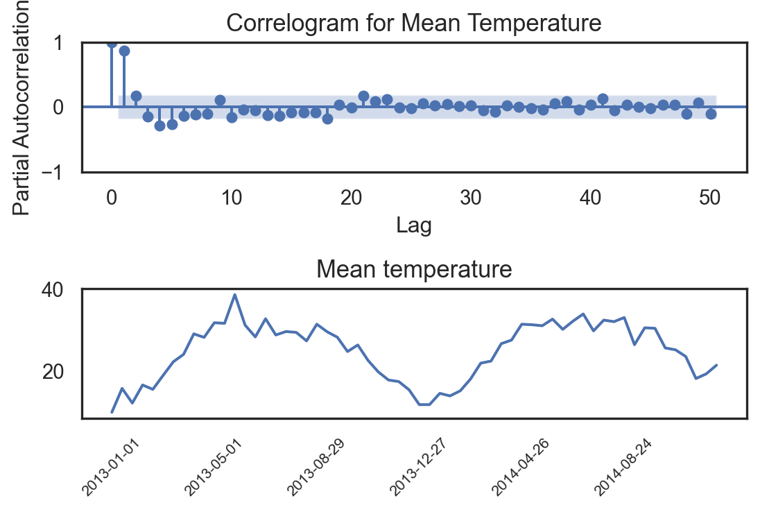

| Date | Open | High | Low | Close | |
|---|---|---|---|---|---|
| 0 | 2012-05-18 | 42.05 | 45.00 | 38.00 | 38.23 |
| 1 | 2012-05-21 | 36.53 | 36.66 | 33.00 | 34.03 |
| 2 | 2012-05-22 | 32.61 | 33.59 | 30.94 | 31.00 |
| 3 | 2012-05-23 | 31.37 | 32.50 | 31.36 | 32.00 |
| 4 | 2012-05-24 | 32.95 | 33.21 | 31.77 | 33.03 |
| 5 | 2012-05-25 | 32.90 | 32.95 | 31.11 | 31.91 |
| 6 | 2012-05-29 | 31.48 | 31.69 | 28.65 | 28.84 |
| 7 | 2012-05-30 | 28.70 | 29.55 | 27.86 | 28.19 |
| 8 | 2012-05-31 | 28.55 | 29.67 | 26.83 | 29.60 |
| 9 | 2012-06-01 | 28.89 | 29.15 | 27.39 | 27.72 |
| 10 | 2012-06-04 | 27.20 | 27.65 | 26.44 | 26.90 |
| 11 | 2012-06-05 | 26.70 | 27.76 | 25.75 | 25.87 |
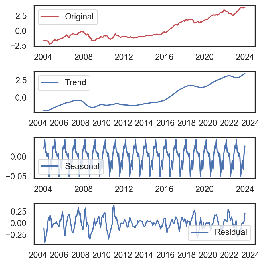
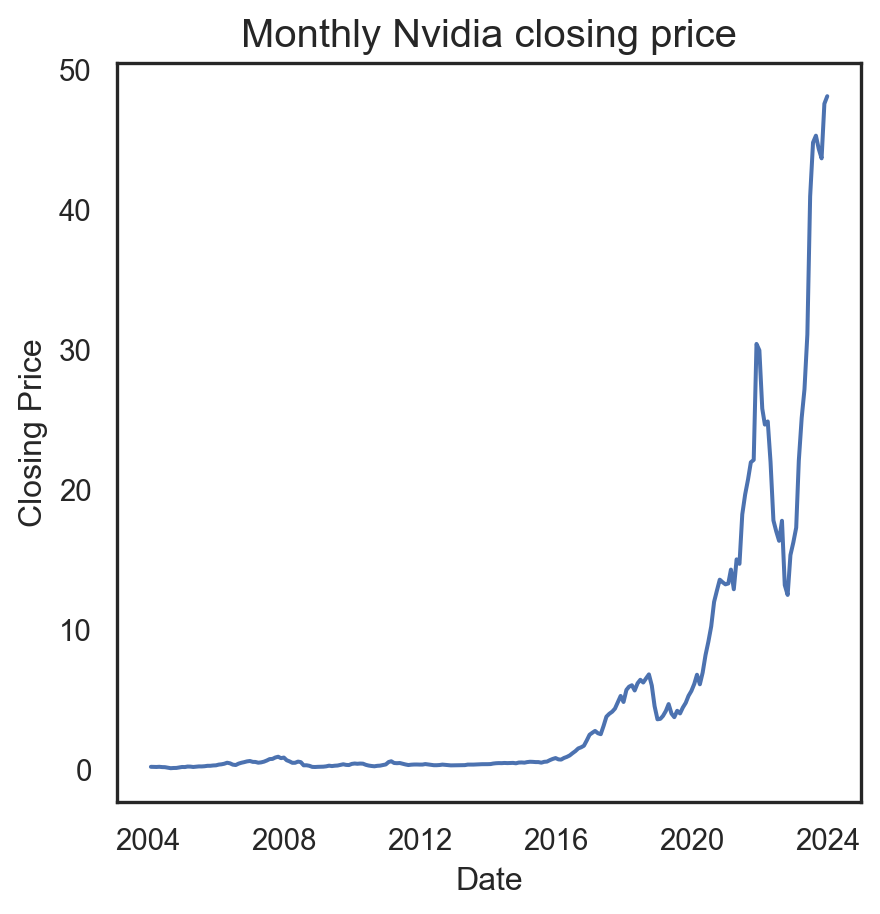
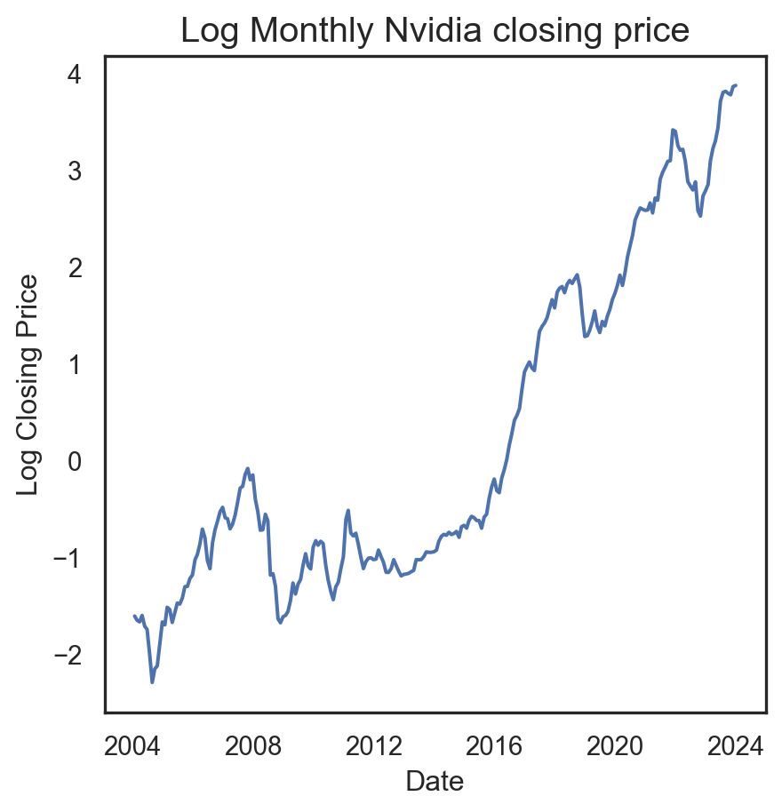
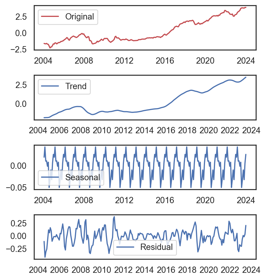
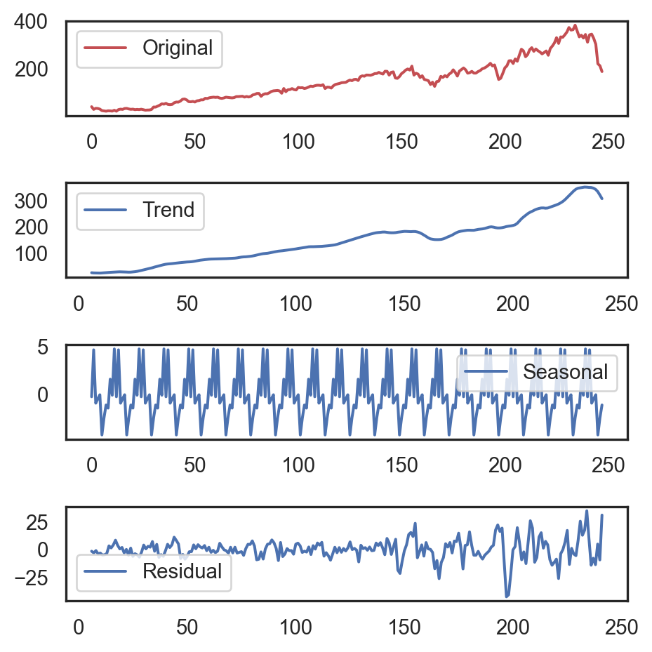
from statsmodels.tsa.seasonal import seasonal_decompose
ts = df_fb[['Close']].values[::10]
decomposition = seasonal_decompose(
    ts, model='additive',
    period=12)
seasonal, trend, residual = decomposition.seasonal, decomposition.trend, decomposition.resid

plt.figure(figsize=(5, 4.5))
plt.subplot(411)
plt.plot(ts, 'r', label='Original')
plt.legend()
plt.subplot(412)
plt.plot(trend, label='Trend')
plt.legend()
plt.subplot(413)
plt.plot(seasonal, label='Seasonal')
plt.legend()
plt.subplot(414)
plt.plot(residual, label='Residual')
plt.legend()
plt.tight_layout()
plt.show()
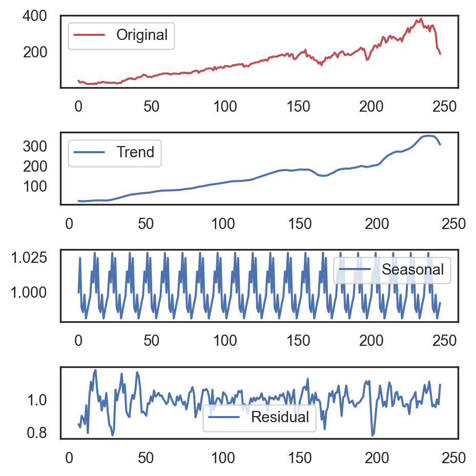
decomposition = seasonal_decompose(
    ts, model='multiplicative',
    period=12)
seasonal, trend, residual = decomposition.seasonal, decomposition.trend, decomposition.resid

plt.figure(figsize=(5, 4.5))
plt.subplot(411)
plt.plot(ts, 'r', label='Original')
plt.legend()
plt.subplot(412)
plt.plot(trend, label='Trend')
plt.legend()
plt.subplot(413)
plt.plot(seasonal, label='Seasonal')
plt.legend()
plt.subplot(414)
plt.plot(residual, label='Residual')
plt.legend()
plt.tight_layout()
plt.show()