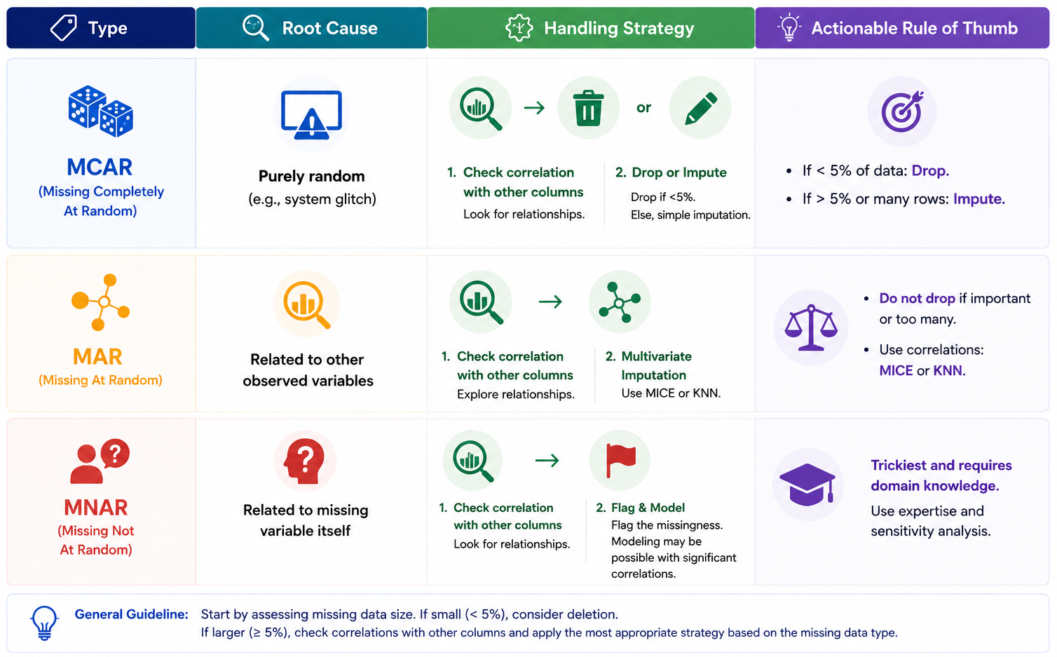
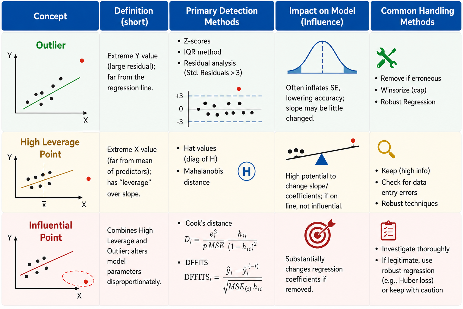
import plotly.graph_objects as go
from plotly.subplots import make_subplots
import numpy as np

# Assuming your DataFrame is named 'data'
data_dropna = data.dropna()
col_quan = ['SibSp', 'Parch', 'Fare']

# 1. Initialize the 2x3 subplot grid
fig_quan = make_subplots(rows=2, cols=3,
                    vertical_spacing=0.22,
                    horizontal_spacing=0.08)

for i, va in enumerate(col_quan):
    # Setup data targets for both rows
    datasets = [
        {"df": data[va].dropna(), "row": 1},
        {"df": data_dropna[va], "row": 2}
    ]

    # Identify the reference X-axis for this column (x, x2, x3)
    match_axis = 'x' if i == 0 else f'x{i+1}'

    for set_idx, target in enumerate(datasets):
        df_series = target["df"]
        curr_row = target["row"]
        curr_col = i + 1

        # Calculate Statistics
        mean_val = df_series.mean()
        median_val = df_series.median()
        std_val = df_series.std()

        # Add Histogram
        fig_quan.add_trace(
            go.Histogram(
                x=df_series,
                histnorm='percent',
                marker_color='#4C72B0',
                opacity=0.6,
                showlegend=False
            ),
            row=curr_row, col=curr_col
        )

        show_in_legend = True if (curr_row == 1 and curr_col == 1) else False

        # Add Mean Vertical Line
        fig_quan.add_vline(
            x=mean_val,
            line_width=2,
            line_dash="dash",
            line_color="#E66101",
            name="Mean",
            showlegend=show_in_legend,
            row=curr_row, col=curr_col
        )

        # Add Median Vertical Line
        fig_quan.add_vline(
            x=median_val,
            line_width=2,
            line_color="#5E3C99",
            name="Median",
            showlegend=show_in_legend,
            row=curr_row, col=curr_col
        )

        # Add Stats Box Annotation
        stats_text = f"Mean: {mean_val:.2f}<br>Med: {median_val:.2f}<br>Std: {std_val:.2f}"
        fig_quan.add_annotation(
            xref="x domain", yref="y domain",
            x=0.95, y=0.95,
            text=stats_text,
            showarrow=False,
            align="left",
            font=dict(size=10, color="black"),
            bordercolor="gray",
            borderwidth=1,
            borderpad=4,
            bgcolor="rgba(255, 255, 255, 0.8)",
            row=curr_row, col=curr_col
        )

        # FIX: Added matches=match_axis to force identical x-ranges per column
        fig_quan.update_xaxes(title_text=va, matches=match_axis, row=curr_row, col=curr_col)

# 2. Add Y-axis labels only to the first column
fig_quan.update_yaxes(title_text="Percent (Before)", row=1, col=1)
fig_quan.update_yaxes(title_text="Percent (After)", row=2, col=1)

# 3. Polish the layout
fig_quan.update_layout(
    {'paper_bgcolor': 'rgba(0, 0, 0, 0)',
     'plot_bgcolor': 'rgba(42, 77, 152, 0)'},
    template="plotly_white",
    title="Quantitative Features Distribution Comparison",
    height=350, # Increased for readability
    width=550,
    margin=dict(t=60, l=60, r=20, b=40),
    legend=dict(orientation="h", yanchor="bottom", y=1.02, xanchor="right", x=1)
)

fig_quan.show()